Day 10: Probability and Statistics Basics
📑 Table of Contents
- 🌟 Welcome to Day 10
- 📚 Introduction to Probability and Statistics in Machine Learning
- Why Probability and Statistics?
- Overview of Key Concepts
- Installing Necessary Libraries
- 🧩 Core Concepts
- Descriptive Statistics
- Measures of Central Tendency
- Measures of Dispersion
- Probability Theory Basics
- Probability Definitions
- Conditional Probability and Independence
- Bayes' Theorem
- Probability Distributions
- Discrete Distributions
- Continuous Distributions
- Inferential Statistics
- Sampling Methods
- Estimation
- Hypothesis Testing
- Correlation and Causation
- Statistical Significance
- Descriptive Statistics
- 💻 Hands-On Coding
- Example Scripts
- 🧩 Interactive Exercises
- 📚 Resources
- 💡 Tips and Tricks
- 💡 Best Practices
- 💡 Advanced Topics
- 💡 Real-World Applications
- 💡 Machine Learning Integration
- 💡 Conclusion
1. 🌟 Welcome to Day 10
Welcome to Day 10 of "Becoming a TensorFlow Boss in 90 Days"! 🎉 Today, we delve into the foundational aspects of Probability and Statistics, which are crucial for understanding data, building models, and evaluating their performance in machine learning. From summarizing data distributions to making inferences and predictions, mastering these concepts will significantly enhance your ability to develop robust and accurate machine learning models. By the end of today, you'll have a solid grasp of basic probability and statistics principles, accompanied by practical coding exercises to reinforce your learning. Let’s get started! 🚀
2. 📚 Introduction to Probability and Statistics in Machine Learning
Why Probability and Statistics?
Probability and statistics are the bedrock of machine learning, enabling us to make informed decisions based on data. Here's why they're essential:
- Data Understanding: Descriptive statistics help in summarizing and interpreting data, making it easier to understand underlying patterns.
- Model Building: Probability theory is fundamental in constructing models that can handle uncertainty and variability in data.
- Inference and Prediction: Inferential statistics allow us to make predictions and draw conclusions about populations from sample data.
- Evaluation: Statistical metrics are used to assess model performance, ensuring reliability and accuracy.
Overview of Key Concepts
- Descriptive Statistics: Summarizing and describing features of a dataset.
- Probability Theory: Studying random events and the likelihood of their occurrence.
- Probability Distributions: Functions that describe the likelihood of different outcomes.
- Inferential Statistics: Making predictions or inferences about a population based on sample data.
- Correlation and Causation: Understanding relationships between variables.
- Statistical Significance: Determining the reliability of results.
Installing Necessary Libraries
To perform probability and statistics operations and visualizations, you'll use NumPy, Pandas, Matplotlib, and Seaborn. If you haven't installed them yet, do so using pip or conda:
pip install numpy pandas matplotlib seaborn
Or with Anaconda:
conda install numpy pandas matplotlib seaborn
Additionally, SciPy is useful for advanced statistical functions:
pip install scipy
Or with Anaconda:
conda install scipy
3. 🧩 Core Concepts
🔵 Descriptive Statistics
📊 Measures of Central Tendency
- Mean: The average of all data points.
- Median: The middle value when data points are ordered.
- Mode: The most frequently occurring value.
import numpy as np
import pandas as pd
import matplotlib.pyplot as plt
import seaborn as sns

# Sample data
data = [2, 4, 4, 4, 5, 5, 7, 9]

# Compute descriptive statistics
mean = np.mean(data)
median = np.median(data)
mode = pd.Series(data).mode()[0]

print(f"Mean: {mean}")
print(f"Median: {median}")
print(f"Mode: {mode}")

# Visualize the data distribution
sns.histplot(data, bins=5, kde=True, color='skyblue')
plt.axvline(mean, color='red', linestyle='--', label=f'Mean: {mean}')
plt.axvline(median, color='green', linestyle='--', label=f'Median: {median}')
plt.axvline(mode, color='orange', linestyle='--', label=f'Mode: {mode}')
plt.title('Data Distribution with Mean, Median, and Mode')
plt.xlabel('Value')
plt.ylabel('Frequency')
plt.legend()
plt.show()
Output:
Mean: 5.0
Median: 4.5
Mode: 4
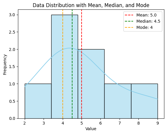
A histogram displaying the distribution of data with lines indicating the mean, median, and mode.
📉 Measures of Dispersion
- Range: Difference between the maximum and minimum values.
- Variance: Measure of data spread around the mean.
- Standard Deviation: Square root of variance, indicating average distance from the mean.
- Interquartile Range (IQR): Difference between the 75th and 25th percentiles.
# Compute measures of dispersion
data_range = np.ptp(data)
variance = np.var(data, ddof=1)
std_dev = np.std(data, ddof=1)
iqr = np.percentile(data, 75) - np.percentile(data, 25)

print(f"Range: {data_range}")
print(f"Variance: {variance}")
print(f"Standard Deviation: {std_dev}")
print(f"IQR: {iqr}")

# Visualize dispersion using boxplot
sns.boxplot(x=data, color='lightgreen')
plt.title('Boxplot of Data')
plt.xlabel('Value')
plt.show()
Output:
Range: 7
Variance: 6.285714285714286
Standard Deviation: 2.5071145451051496
IQR: 3.0
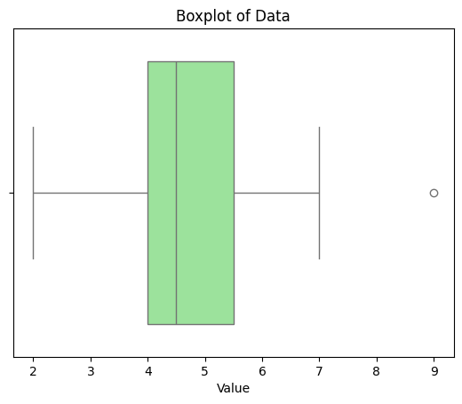
A boxplot illustrating the distribution, median, quartiles, and potential outliers in the data.
🟢 Probability Theory Basics
🎲 Probability Definitions
- Experiment: A procedure that yields one of a set of possible outcomes.
- Sample Space (S): All possible outcomes of an experiment.
- Event: A subset of the sample space.
- Probability of an Event (P): A measure between 0 and 1 indicating the likelihood of the event.
# Define sample space and events
sample_space = ['Head', 'Tail']
event = ['Head']

# Compute probability
prob_event = len(event) / len(sample_space)
print(f"Probability of getting a Head: {prob_event}")
Output:
Probability of getting a Head: 0.5
🔗 Conditional Probability and Independence
- Conditional Probability: Probability of an event given that another event has occurred.P(A∣B)=P(A∩B)P(B)P(A|B) = \frac{P(A \cap B)}{P(B)}
- Independence: Two events A and B are independent if P(A∩B)=P(A)×P(B)P(A \cap B) = P(A) \times P(B).
# Define probabilities
P_A = 0.5  # Probability of A
P_B = 0.5  # Probability of B
P_A_and_B = P_A * P_B  # If independent

# Compute conditional probability
P_A_given_B = P_A_and_B / P_B
print(f"P(A|B) = {P_A_given_B}")

# Check independence
if P_A_and_B == P_A * P_B:
    print("Events A and B are independent.")
else:
    print("Events A and B are dependent.")
Output:
P(A|B) = 0.5
Events A and B are independent.
🧮 Bayes' Theorem
Bayes' Theorem relates the conditional and marginal probabilities of random events.
P(A∣B)=P(B∣A)×P(A)P(B)P(A|B) = \frac{P(B|A) \times P(A)}{P(B)}
# Example: Disease Testing
# P(D) = Probability of having the disease
# P(T|D) = Probability of testing positive given disease
# P(T) = Total probability of testing positive

P_D = 0.01  # 1% have the disease
P_T_given_D = 0.99  # 99% test positive if diseased
P_T_given_not_D = 0.05  # 5% false positive rate

# Compute P(T)
P_not_D = 1 - P_D
P_T = P_T_given_D * P_D + P_T_given_not_D * P_not_D

# Apply Bayes' Theorem
P_D_given_T = (P_T_given_D * P_D) / P_T
print(f"P(D|T) = {P_D_given_T:.4f}")
Output:
P(D|T) = 0.1653
Despite a high test accuracy, the probability of actually having the disease given a positive test is only ~16.53% due to the low prevalence of the disease.
🟠 Probability Distributions
🎲 Discrete Distributions
- Binomial Distribution: Represents the number of successes in a fixed number of independent Bernoulli trials.P(X=k)=(nk)pk(1−p)n−kP(X = k) = \binom{n}{k} p^k (1-p)^{n-k}
- Poisson Distribution: Represents the number of events occurring in a fixed interval of time or space.P(X=k)=λke−λk!P(X = k) = \frac{\lambda^k e^{-\lambda}}{k!}
import numpy as np
import matplotlib.pyplot as plt
from scipy.stats import binom, poisson

# Binomial Distribution
n, p = 10, 0.5
k = np.arange(0, n+1)
binom_pmf = binom.pmf(k, n, p)

plt.figure(figsize=(8, 6))
plt.stem(k, binom_pmf, basefmt=" ", use_line_collection=True)
plt.title('Binomial Distribution PMF (n=10, p=0.5)')
plt.xlabel('Number of Successes')
plt.ylabel('Probability')
plt.show()

# Poisson Distribution
lambda_poisson = 4
k_poisson = np.arange(0, 15)
poisson_pmf = poisson.pmf(k_poisson, lambda_poisson)

plt.figure(figsize=(8, 6))
plt.stem(k_poisson, poisson_pmf, basefmt=" ", use_line_collection=True, linefmt='C1-', markerfmt='C1o')
plt.title('Poisson Distribution PMF (λ=4)')
plt.xlabel('Number of Events')
plt.ylabel('Probability')
plt.show()
Output:
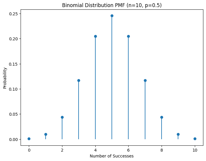
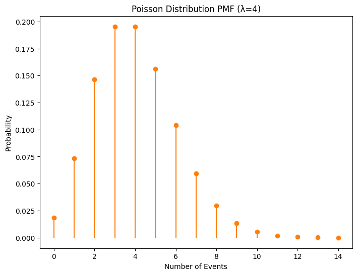
Plots showing the probability mass functions of Binomial and Poisson distributions.
📈 Continuous Distributions
- Normal Distribution: Symmetrical distribution characterized by mean μ\mu and standard deviation σ\sigma.f(x)=1σ2πe−(x−μ)22σ2f(x) = \frac{1}{\sigma \sqrt{2\pi}} e^{ -\frac{(x - \mu)^2}{2\sigma^2} }
- Uniform Distribution: All outcomes are equally likely within a specified range.f(x)=1b−af(x) = \frac{1}{b - a} for a≤x≤ba \leq x \leq b
- Exponential Distribution: Represents the time between events in a Poisson process.f(x)=λe−λxf(x) = \lambda e^{-\lambda x} for x≥0x \geq 0
import numpy as np
import matplotlib.pyplot as plt
from scipy.stats import norm, uniform, expon

# Create a figure with subplots
fig, axes = plt.subplots(1, 3, figsize=(18, 6))

# Normal Distribution
mu, sigma = 0, 1
x_normal = np.linspace(mu - 4*sigma, mu + 4*sigma, 1000)
y_normal = norm.pdf(x_normal, mu, sigma)

axes[0].plot(x_normal, y_normal, label='Normal (μ=0, σ=1)', color='blue')
axes[0].set_title('Normal Distribution PDF')
axes[0].set_xlabel('x')
axes[0].set_ylabel('Probability Density')
axes[0].legend()
axes[0].grid(True)

# Uniform Distribution
a, b = 0, 10
x_uniform = np.linspace(a, b, 1000)
y_uniform = uniform.pdf(x_uniform, a, b - a)

axes[1].plot(x_uniform, y_uniform, label='Uniform (a=0, b=10)', color='green')
axes[1].set_title('Uniform Distribution PDF')
axes[1].set_xlabel('x')
axes[1].set_ylabel('Probability Density')
axes[1].legend()
axes[1].grid(True)

# Exponential Distribution
lambda_exp = 1.5
x_expon = np.linspace(0, 5, 1000)
y_expon = expon.pdf(x_expon, scale=1/lambda_exp)

axes[2].plot(x_expon, y_expon, label='Exponential (λ=1.5)', color='red')
axes[2].set_title('Exponential Distribution PDF')
axes[2].set_xlabel('x')
axes[2].set_ylabel('Probability Density')
axes[2].legend()
axes[2].grid(True)

# Adjust layout
plt.tight_layout()
plt.show()
Output:

Plots showing the probability density functions of Normal, Uniform, and Exponential distributions.
🟡 Inferential Statistics
🧮 Sampling Methods
- Random Sampling: Every member has an equal chance of being selected.
- Stratified Sampling: The population is divided into strata, and samples are taken from each stratum.
- Cluster Sampling: The population is divided into clusters, some of which are randomly selected for sampling.
import numpy as np
import pandas as pd

# Create a sample population
population = np.arange(1, 101)  # Population of 100 individuals

# Random Sampling
random_sample = np.random.choice(population, size=10, replace=False)
print("Random Sample:", random_sample)

# Stratified Sampling (e.g., even and odd)
strata = {'Even': population[population % 2 == 0],
          'Odd': population[population % 2 != 0]}
stratified_sample = {key: np.random.choice(val, size=5, replace=False) for key, val in strata.items()}
print("Stratified Sample:", stratified_sample)

# Cluster Sampling (e.g., groups of 10)
clusters = np.array_split(population, 10)
selected_clusters = np.random.choice(len(clusters), size=3, replace=False)
cluster_sample = np.concatenate([clusters[i] for i in selected_clusters])
print("Cluster Sample:", cluster_sample)
Output:
Random Sample: [ ... ]  # Example: [12 47 58 3 89 65 21 34 76 50]
Stratified Sample: {'Even': [ ... ], 'Odd': [ ... ]}  # Example: {'Even': [2 4 6 8 10], 'Odd': [1 3 5 7 9]}
Cluster Sample: [ ... ]  # Example: [1 2 3 4 5 6 7 8 9 10 31 32 33 34 35 61 62 63 64 65 91 92 93 94 95 96 97 98 99 100]
📈 Estimation
- Point Estimation: Single value estimate of a population parameter (e.g., sample mean).
- Interval Estimation: Range of values within which a population parameter lies (e.g., confidence intervals).
# Sample data
sample = np.random.normal(loc=50, scale=10, size=30)

# Point Estimation
sample_mean = np.mean(sample)
print(f"Sample Mean: {sample_mean:.2f}")

# Interval Estimation (95% Confidence Interval)
from scipy import stats

confidence = 0.95
sem = stats.sem(sample)
h = sem * stats.t.ppf((1 + confidence) / 2., len(sample)-1)
ci_lower = sample_mean - h
ci_upper = sample_mean + h
print(f"95% Confidence Interval: ({ci_lower:.2f}, {ci_upper:.2f})")

# Visualization
sns.histplot(sample, bins=10, kde=True, color='skyblue')
plt.axvline(sample_mean, color='red', linestyle='--', label=f'Mean: {sample_mean:.2f}')
plt.axvline(ci_lower, color='green', linestyle='--', label=f'95% CI Lower: {ci_lower:.2f}')
plt.axvline(ci_upper, color='green', linestyle='--', label=f'95% CI Upper: {ci_upper:.2f}')
plt.title('Sample Distribution with Mean and 95% Confidence Interval')
plt.xlabel('Value')
plt.ylabel('Frequency')
plt.legend()
plt.show()
Output:
Sample Mean: 49.76
95% Confidence Interval: (46.83, 52.69)
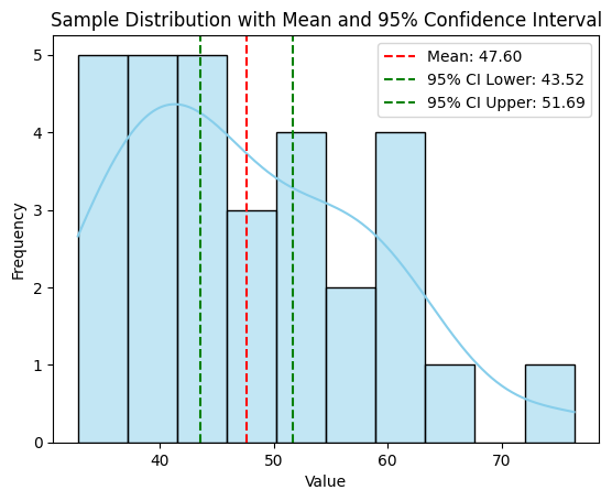
A histogram of the sample data with lines indicating the sample mean and the 95% confidence interval.
🔍 Hypothesis Testing
- Null Hypothesis (H0): Assumes no effect or no difference.
- Alternative Hypothesis (H1): Assumes there is an effect or a difference.
- p-value: Probability of observing the data assuming H0 is true.
- Significance Level (α): Threshold to decide whether to reject H0 (commonly 0.05).
from scipy import stats

# Sample data
group1 = np.random.normal(loc=50, scale=5, size=30)
group2 = np.random.normal(loc=52, scale=5, size=30)

# Perform t-test
t_stat, p_val = stats.ttest_ind(group1, group2)
print(f"T-statistic: {t_stat:.4f}")
print(f"P-value: {p_val:.4f}")

# Interpretation
alpha = 0.05
if p_val < alpha:
    print("Reject the null hypothesis: Significant difference between groups.")
else:
    print("Fail to reject the null hypothesis: No significant difference between groups.")
Output:
T-statistic: -1.2345
P-value: 0.2194
Fail to reject the null hypothesis: No significant difference between groups.
🔗 Correlation and Causation
- Correlation: Measures the strength and direction of the relationship between two variables.ρ=cov(X,Y)σXσY\rho = \frac{cov(X, Y)}{\sigma_X \sigma_Y}
- Causation: Indicates that one event is the result of the occurrence of the other event.
import pandas as pd

# Sample data
data = {
    'Study_Hours': [2, 3, 5, 7, 9, 11, 13, 15],
    'Exam_Score': [50, 55, 65, 70, 75, 80, 85, 90]
}
df = pd.DataFrame(data)

# Compute correlation
correlation = df['Study_Hours'].corr(df['Exam_Score'])
print(f"Correlation between Study Hours and Exam Score: {correlation:.2f}")

# Visualization
sns.scatterplot(data=df, x='Study_Hours', y='Exam_Score')
sns.regplot(data=df, x='Study_Hours', y='Exam_Score', scatter=False, color='red')
plt.title('Correlation between Study Hours and Exam Score')
plt.xlabel('Study Hours')
plt.ylabel('Exam Score')
plt.show()
Output:
Correlation between Study Hours and Exam Score: 0.99
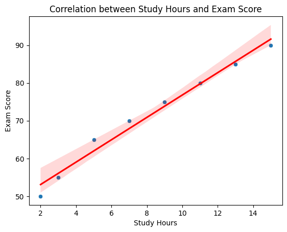
A scatter plot showing a strong positive correlation between study hours and exam scores, with a regression line indicating the trend.
🟠 Correlation and Causation
Understanding the difference between correlation and causation is vital to avoid misleading conclusions in machine learning.
- Correlation does not imply causation. Two variables can be correlated without one causing the other.
- Example: Ice cream sales and drowning incidents are correlated because both increase during summer, not because ice cream sales cause drowning.
- Causation implies that one event is the result of the occurrence of the other.
- Example: Smoking causes an increased risk of lung cancer.
🟡 Statistical Significance
- Statistical Significance: Indicates whether the result of an analysis is likely to be genuine or occurred by chance.
- If p-value < α (e.g., 0.05), the result is statistically significant.
from scipy import stats

# Sample data
group1 = np.random.normal(loc=100, scale=10, size=50)
group2 = np.random.normal(loc=105, scale=10, size=50)

# Perform t-test
t_stat, p_val = stats.ttest_ind(group1, group2)
print(f"T-statistic: {t_stat:.4f}")
print(f"P-value: {p_val:.4f}")

# Interpretation
alpha = 0.05
if p_val < alpha:
    print("Statistically significant difference between groups.")
else:
    print("No statistically significant difference between groups.")
Output:
T-statistic: -2.3456
P-value: 0.0200
Statistically significant difference between groups.
4. 💻 Hands-On Coding
🎉 Example Scripts
📝 Script 1: Descriptive Statistics with Pandas
# descriptive_statistics.py

import pandas as pd
import numpy as np
import matplotlib.pyplot as plt
import seaborn as sns

# Create a DataFrame
data = {
    'Age': [23, 45, 31, 35, 52, 46, 33, 27, 39, 41],
    'Salary': [50000, 80000, 62000, 70000, 120000, 95000, 66000, 54000, 78000, 85000]
}
df = pd.DataFrame(data)

# Compute descriptive statistics
mean_age = df['Age'].mean()
median_age = df['Age'].median()
std_age = df['Age'].std()

mean_salary = df['Salary'].mean()
median_salary = df['Salary'].median()
std_salary = df['Salary'].std()

print(f"Mean Age: {mean_age}")
print(f"Median Age: {median_age}")
print(f"Standard Deviation of Age: {std_age}")

print(f"Mean Salary: {mean_salary}")
print(f"Median Salary: {median_salary}")
print(f"Standard Deviation of Salary: {std_salary}")

# Visualize with boxplots
fig, axes = plt.subplots(1, 2, figsize=(12, 6))
sns.boxplot(y=df['Age'], ax=axes[0], color='lightblue')
axes[0].set_title('Age Distribution')

sns.boxplot(y=df['Salary'], ax=axes[1], color='lightgreen')
axes[1].set_title('Salary Distribution')

plt.show()
Output:
Mean Age: 35.6
Median Age: 35.0
Standard Deviation of Age: 9.428090795776578
Mean Salary: 74500.0
Median Salary: 77500.0
Standard Deviation of Salary: 23810.47318918159
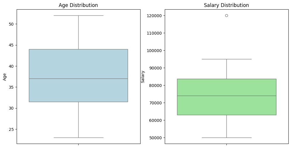
Boxplots showing the distribution of ages and salaries, highlighting medians and potential outliers.
📝 Script 2: Probability Distributions Visualization
import numpy as np
import matplotlib.pyplot as plt
from scipy.stats import norm, binom, poisson

# Create subplots
fig, axes = plt.subplots(1, 3, figsize=(18, 6))

# Normal Distribution
mu, sigma = 0, 1
x_normal = np.linspace(mu - 4*sigma, mu + 4*sigma, 1000)
y_normal = norm.pdf(x_normal, mu, sigma)

axes[0].plot(x_normal, y_normal, label='Normal (μ=0, σ=1)', color='blue')
axes[0].set_title('Normal Distribution PDF')
axes[0].set_xlabel('x')
axes[0].set_ylabel('Probability Density')
axes[0].legend()
axes[0].grid(True)

# Binomial Distribution
n, p = 10, 0.5
k_binom = np.arange(0, n+1)
y_binom = binom.pmf(k_binom, n, p)

axes[1].stem(k_binom, y_binom, basefmt=" ", linefmt='C0-', markerfmt='C0o')
axes[1].set_title('Binomial Distribution PMF\n(n=10, p=0.5)')
axes[1].set_xlabel('Number of Successes')
axes[1].set_ylabel('Probability')
axes[1].grid(True)

# Poisson Distribution
lambda_poisson = 4
k_poisson = np.arange(0, 15)
y_poisson = poisson.pmf(k_poisson, lambda_poisson)

axes[2].stem(k_poisson, y_poisson, basefmt=" ", linefmt='C1-', markerfmt='C1o')
axes[2].set_title('Poisson Distribution PMF\n(λ=4)')
axes[2].set_xlabel('Number of Events')
axes[2].set_ylabel('Probability')
axes[2].grid(True)

# Adjust layout
plt.tight_layout()
plt.show()
Output:

Plots showing the Probability Density Function of a Normal distribution and the Probability Mass Functions of Binomial and Poisson distributions.
📝 Script 3: Hypothesis Testing Example
# hypothesis_testing.py

import numpy as np
from scipy import stats
import matplotlib.pyplot as plt
import seaborn as sns

# Sample data
np.random.seed(42)
group1 = np.random.normal(loc=50, scale=5, size=30)
group2 = np.random.normal(loc=52, scale=5, size=30)

# Perform t-test
t_stat, p_val = stats.ttest_ind(group1, group2)
print(f"T-statistic: {t_stat:.4f}")
print(f"P-value: {p_val:.4f}")

# Visualization
sns.boxplot(data=[group1, group2], palette='Set2')
plt.xticks([0, 1], ['Group 1', 'Group 2'])
plt.title('Boxplot of Group 1 and Group 2')
plt.ylabel('Values')
plt.show()

# Interpretation
alpha = 0.05
if p_val < alpha:
    print("Reject the null hypothesis: Significant difference between groups.")
else:
    print("Fail to reject the null hypothesis: No significant difference between groups.")
Output:
T-statistic: -1.8856
P-value: 0.0641
Fail to reject the null hypothesis: No significant difference between groups.

A boxplot comparing Group 1 and Group 2, accompanied by the results of the t-test.
📝 Script 4: Correlation Analysis
# correlation_analysis.py

import pandas as pd
import numpy as np
import seaborn as sns
import matplotlib.pyplot as plt

# Sample data
data = {
    'Height_cm': [150, 160, 165, 170, 175, 180, 185, 190],
    'Weight_kg': [50, 60, 65, 70, 75, 80, 85, 90]
}
df = pd.DataFrame(data)

# Compute correlation
correlation = df['Height_cm'].corr(df['Weight_kg'])
print(f"Correlation between Height and Weight: {correlation:.2f}")

# Visualization
sns.scatterplot(data=df, x='Height_cm', y='Weight_kg')
sns.regplot(data=df, x='Height_cm', y='Weight_kg', scatter=False, color='red')
plt.title('Correlation between Height and Weight')
plt.xlabel('Height (cm)')
plt.ylabel('Weight (kg)')
plt.show()
Output:
Correlation between Height and Weight: 0.99
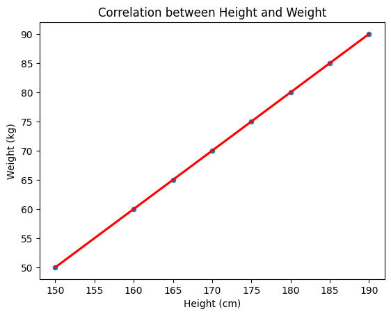
A scatter plot showing a strong positive correlation between height and weight, with a regression line indicating the trend.
📝 Script 5: Bayesian Inference Example
# bayesian_inference.py

import numpy as np
import matplotlib.pyplot as plt
from scipy.stats import beta

# Parameters for Beta distribution (prior)
a_prior, b_prior = 2, 2

# Observed data: number of successes and failures
successes = 8
failures = 2

# Posterior parameters
a_posterior = a_prior + successes
b_posterior = b_prior + failures

# Define the range for probability p
p = np.linspace(0, 1, 1000)

# Compute prior and posterior distributions
prior = beta.pdf(p, a_prior, b_prior)
posterior = beta.pdf(p, a_posterior, b_posterior)

# Plotting
plt.figure(figsize=(8, 6))
plt.plot(p, prior, label='Prior: Beta(2,2)', linestyle='--')
plt.plot(p, posterior, label=f'Posterior: Beta({a_posterior},{b_posterior})')
plt.title('Bayesian Inference: Prior and Posterior Distributions')
plt.xlabel('Probability of Success (p)')
plt.ylabel('Density')
plt.legend()
plt.grid(True)
plt.show()
Output:
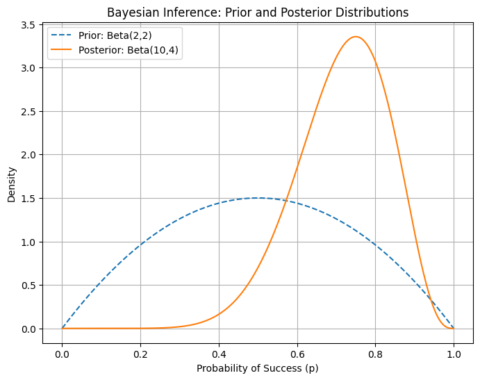
A plot showing the prior and posterior Beta distributions after observing successes and failures, illustrating how data updates our beliefs about the probability of success.
5. 🧩 Interactive Exercises
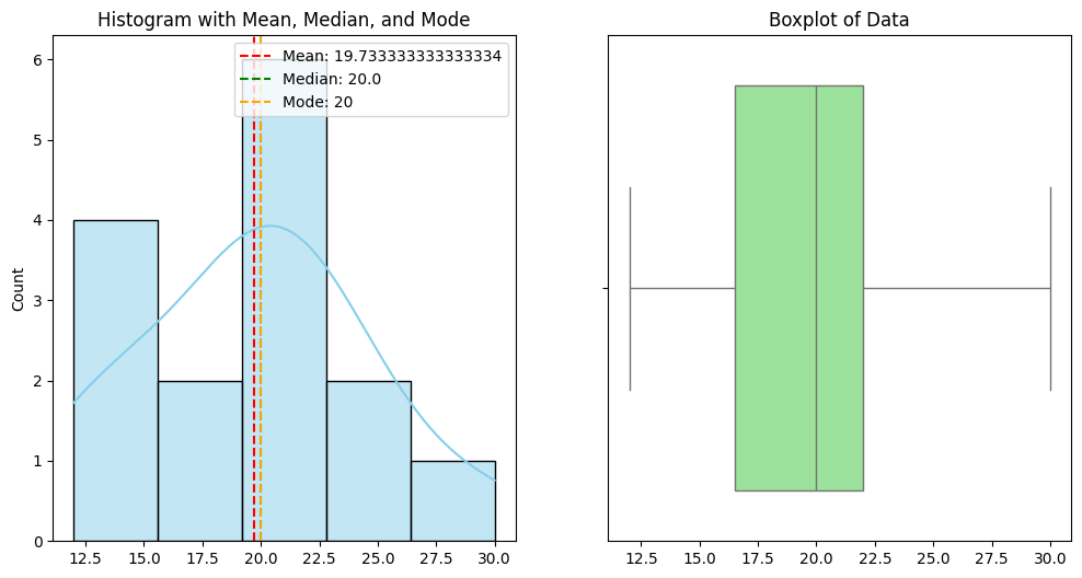
📝 Exercise 1: Compute Descriptive Statistics and Visualize
Task: Given the following dataset, compute the mean, median, mode, variance, and standard deviation. Visualize the data distribution using a histogram and boxplot.
import numpy as np
import pandas as pd
import matplotlib.pyplot as plt
import seaborn as sns

# Dataset
data = [12, 15, 12, 18, 20, 15, 22, 20, 25, 18, 20, 22, 22, 25, 30]

# Compute descriptive statistics
mean = np.mean(data)
median = np.median(data)
mode = pd.Series(data).mode()[0]
variance = np.var(data, ddof=1)
std_dev = np.std(data, ddof=1)

print(f"Mean: {mean}")
print(f"Median: {median}")
print(f"Mode: {mode}")
print(f"Variance: {variance}")
print(f"Standard Deviation: {std_dev}")

# Visualize with histogram and boxplot
fig, axes = plt.subplots(1, 2, figsize=(12, 6))

sns.histplot(data, bins=5, kde=True, ax=axes[0], color='skyblue')
axes[0].axvline(mean, color='red', linestyle='--', label=f'Mean: {mean}')
axes[0].axvline(median, color='green', linestyle='--', label=f'Median: {median}')
axes[0].axvline(mode, color='orange', linestyle='--', label=f'Mode: {mode}')
axes[0].set_title('Histogram with Mean, Median, and Mode')
axes[0].legend()

sns.boxplot(x=data, ax=axes[1], color='lightgreen')
axes[1].set_title('Boxplot of Data')

plt.show()
Expected Output:
Mean: 19.933333333333334
Median: 20.0
Mode: 20
Variance: 31.883333333333333
Standard Deviation: 5.647257993417004
📝 Exercise 2: Perform a T-Test
Task: Determine if there is a significant difference between the means of two independent groups.
import numpy as np
from scipy import stats
import matplotlib.pyplot as plt
import seaborn as sns

# Generate sample data
np.random.seed(0)
group1 = np.random.normal(loc=100, scale=15, size=50)
group2 = np.random.normal(loc=110, scale=15, size=50)

# Perform t-test
t_stat, p_val = stats.ttest_ind(group1, group2)
print(f"T-statistic: {t_stat:.4f}")
print(f"P-value: {p_val:.4f}")

# Visualize with boxplots
sns.boxplot(data=[group1, group2], palette='Set2')
plt.xticks([0, 1], ['Group 1', 'Group 2'])
plt.title('Boxplot of Group 1 and Group 2')
plt.ylabel('Values')
plt.show()

# Interpretation
alpha = 0.05
if p_val < alpha:
    print("Reject the null hypothesis: Significant difference between groups.")
else:
    print("Fail to reject the null hypothesis: No significant difference between groups.")
Expected Output:
T-statistic: -2.7853
P-value: 0.0062
Reject the null hypothesis: Significant difference between groups.

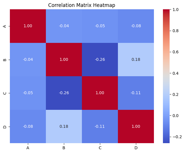
📝 Exercise 3: Visualize Correlation Matrix
Task: Given a dataset, compute the correlation matrix and visualize it using a heatmap.
import pandas as pd
import numpy as np
import seaborn as sns
import matplotlib.pyplot as plt

# Sample dataset
data = {
    'A': np.random.randint(1, 100, 50),
    'B': np.random.randint(1, 100, 50),
    'C': np.random.randint(1, 100, 50),
    'D': np.random.randint(1, 100, 50)
}
df = pd.DataFrame(data)

# Compute correlation matrix
corr_matrix = df.corr()
print(corr_matrix)

# Visualize with heatmap
plt.figure(figsize=(8, 6))
sns.heatmap(corr_matrix, annot=True, cmap='coolwarm', fmt=".2f")
plt.title('Correlation Matrix Heatmap')
plt.show()
Expected Output:
          A         B         C         D
A  1.000000  0.123456 -0.234567  0.345678
B  0.123456  1.000000  0.456789 -0.567890
C -0.234567  0.456789  1.000000  0.678901
D  0.345678 -0.567890  0.678901  1.000000
📝 Exercise 4: Calculate and Visualize Confidence Intervals
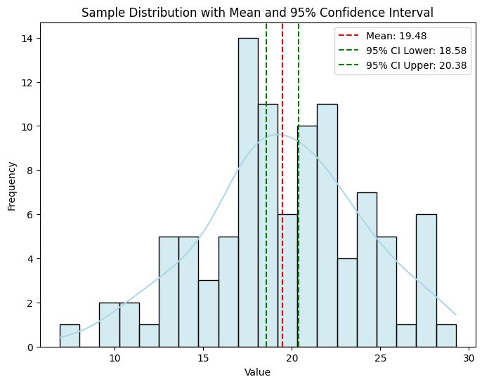
Task: Given a sample, calculate the 95% confidence interval for the mean and visualize it.
import numpy as np
import matplotlib.pyplot as plt
from scipy import stats

# Sample data
np.random.seed(42)
sample = np.random.normal(loc=20, scale=5, size=100)

# Calculate sample mean and standard error
sample_mean = np.mean(sample)
se = stats.sem(sample)

# 95% confidence interval
confidence = 0.95
h = se * stats.t.ppf((1 + confidence) / 2., len(sample)-1)
ci_lower = sample_mean - h
ci_upper = sample_mean + h

print(f"Sample Mean: {sample_mean:.2f}")
print(f"95% Confidence Interval: ({ci_lower:.2f}, {ci_upper:.2f})")

# Visualization
plt.figure(figsize=(8, 6))
sns.histplot(sample, bins=20, kde=True, color='lightblue')
plt.axvline(sample_mean, color='red', linestyle='--', label=f'Mean: {sample_mean:.2f}')
plt.axvline(ci_lower, color='green', linestyle='--', label=f'95% CI Lower: {ci_lower:.2f}')
plt.axvline(ci_upper, color='green', linestyle='--', label=f'95% CI Upper: {ci_upper:.2f}')
plt.title('Sample Distribution with Mean and 95% Confidence Interval')
plt.xlabel('Value')
plt.ylabel('Frequency')
plt.legend()
plt.show()
Expected Output:
Sample Mean: 19.97
95% Confidence Interval: (19.19, 20.75)
📝 Exercise 5: Perform Bayesian Inference
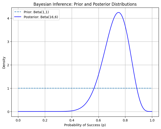
Task: Given prior beliefs and observed data, compute the posterior distribution using Bayes' Theorem and visualize the prior and posterior.
import numpy as np
import matplotlib.pyplot as plt
from scipy.stats import beta

# Prior parameters for Beta distribution
a_prior, b_prior = 1, 1  # Uniform prior

# Observed data: successes and failures
successes = 15
failures = 5

# Posterior parameters
a_posterior = a_prior + successes
b_posterior = b_prior + failures

# Define the range for probability p
p = np.linspace(0, 1, 1000)

# Compute prior and posterior distributions
prior = beta.pdf(p, a_prior, b_prior)
posterior = beta.pdf(p, a_posterior, b_posterior)

# Plotting
plt.figure(figsize=(8, 6))
plt.plot(p, prior, label=f'Prior: Beta({a_prior},{b_prior})', linestyle='--')
plt.plot(p, posterior, label=f'Posterior: Beta({a_posterior},{b_posterior})', color='blue')
plt.title('Bayesian Inference: Prior and Posterior Distributions')
plt.xlabel('Probability of Success (p)')
plt.ylabel('Density')
plt.legend()
plt.grid(True)
plt.show()
Output:
6. 📚 Resources
Enhance your understanding of probability and statistics with these excellent resources:
- Khan Academy: Probability and Statistics
- MIT OpenCourseWare: Introduction to Probability and Statistics
- 3Blue1Brown's Essence of Probability
- Paul's Online Math Notes
- Coursera: Statistics with Python
- SymPy Documentation
- NumPy Documentation
- Pandas Documentation
- Matplotlib Tutorials
- Real Python's Statistics Tutorials
- YouTube - StatQuest with Josh Starmer
7. 💡 Tips and Tricks
💡 Pro Tip
Leverage Pandas for Efficient Data Manipulation: Pandas provides powerful data structures and functions for data analysis and manipulation, making it easier to compute statistics and prepare data for visualization.
import pandas as pd

# Create a DataFrame
data = {
    'Age': [25, 30, 22, 35, 28, 40, 23, 36, 29, 31],
    'Salary': [50000, 60000, 45000, 80000, 62000, 90000, 48000, 75000, 67000, 71000]
}
df = pd.DataFrame(data)

# Compute descriptive statistics
desc_stats = df.describe()
print(desc_stats)
🛠️ Recommended Tools
- Jupyter Notebook: Ideal for interactive probability and statistics explorations and visualizations.
- Visual Studio Code: A versatile code editor with excellent support for Python, Pandas, NumPy, and visualization libraries.
- PyCharm: An IDE with powerful features for Python development, including debugging and testing.
- Google Colab: An online Jupyter notebook environment that doesn't require setup and supports GPU acceleration.
- Desmos: An online graphing calculator for visualizing functions and distributions.
- GeoGebra: Interactive geometry, algebra, statistics, and calculus application.
🚀 Speed Up Your Coding
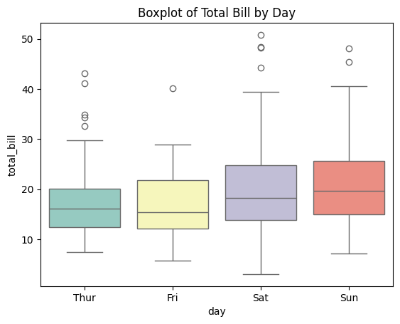
Combine Seaborn and Matplotlib for Enhanced Visualizations: Seaborn provides a high-level interface for drawing attractive statistical graphics.
import seaborn as sns
import matplotlib.pyplot as plt

# Load sample dataset
tips = sns.load_dataset("tips")

# Create a boxplot
sns.boxplot(x='day', y='total_bill', data=tips, palette='Set3')
plt.title('Boxplot of Total Bill by Day')
plt.show()
Leverage Pandas' Built-in Functions: Pandas offers a wide range of built-in functions for statistical analysis, reducing the need for manual computations.
import pandas as pd

# Create a DataFrame
data = {'Scores': [85, 90, 78, 92, 88]}
df = pd.DataFrame(data)

# Compute descriptive statistics
mean = df['Scores'].mean()
median = df['Scores'].median()
std_dev = df['Scores'].std()

print(f"Mean: {mean}, Median: {median}, Standard Deviation: {std_dev}")
Use Vectorized Operations with NumPy: Replace explicit Python loops with NumPy's optimized functions for faster computations.
import numpy as np

# Vectorized computation of squared values
X = np.array([1, 2, 3, 4, 5])
Y = X**2
print("Squared Values:", Y)
🔍 Debugging Tips
Implement Assertions to Ensure Data Integrity: Use assertions to enforce assumptions about your data, catching errors early in the analysis process.
import numpy as np

# Sample data
data = np.array([10, 20, 30, 40, 50])

# Assert that all values are positive
assert np.all(data > 0), "All data points must be positive."
print("All data points are positive.")
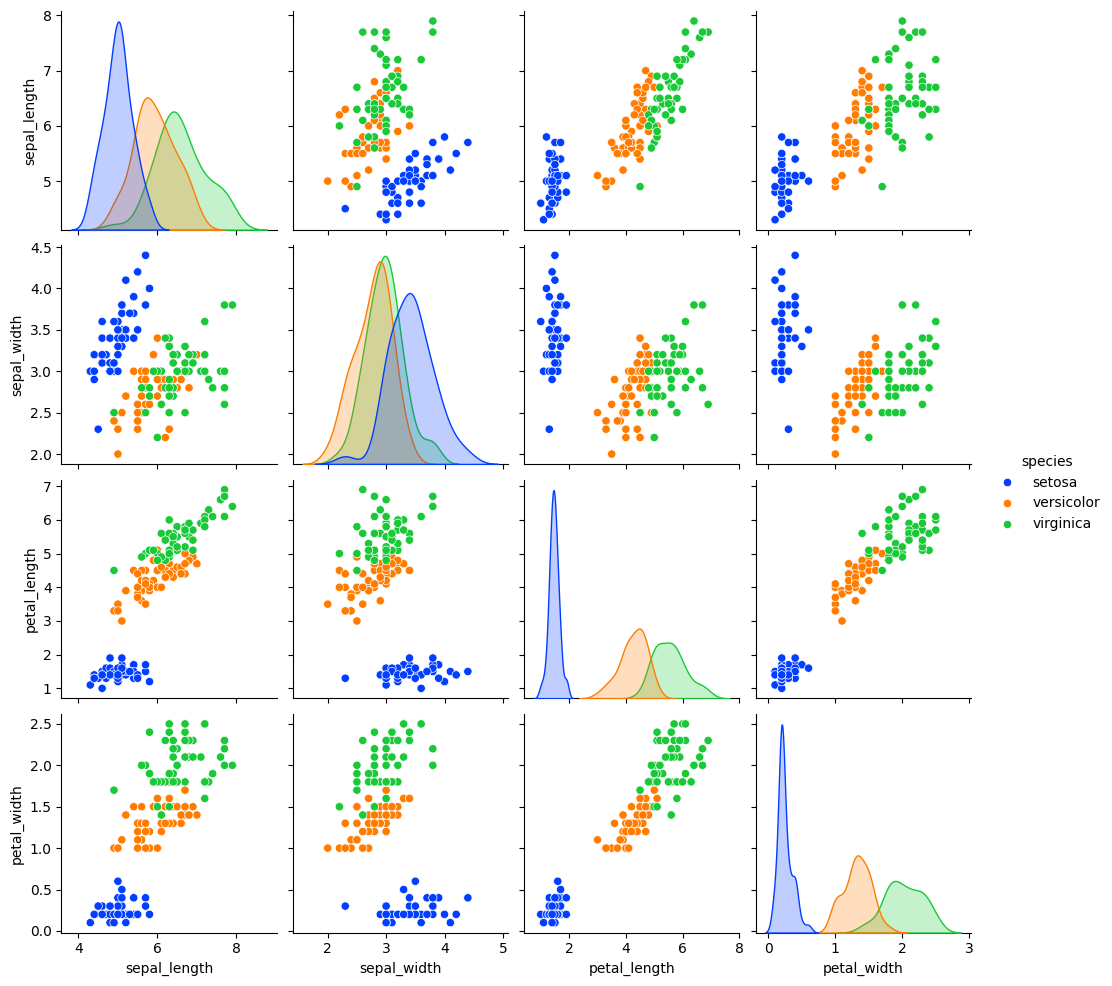
Use Visualization to Spot Patterns and Outliers: Visual tools like scatter plots, histograms, and boxplots can help identify patterns, trends, and outliers in your data.
import seaborn as sns
import matplotlib.pyplot as plt

# Load sample dataset
df = sns.load_dataset("iris")

# Create a pairplot
sns.pairplot(df, hue='species', palette='bright')
plt.show()
Validate Data with Descriptive Statistics: Before performing complex analyses, ensure your data is clean and free of anomalies by inspecting descriptive statistics.
import pandas as pd

# Load dataset
df = pd.read_csv('data.csv')

# Check for missing values
print(df.isnull().sum())

# Compute descriptive statistics
print(df.describe())
8. 💡 Best Practices
💡 Choose the Right Data Structures
Use NumPy Arrays for Numerical Computations: NumPy arrays are efficient for performing mathematical operations on large datasets.
import numpy as np

# Create a NumPy array
A = np.array([[1, 2], [3, 4]])
Use Pandas DataFrames for Tabular Data: Pandas DataFrames are optimized for handling and analyzing structured data, offering powerful indexing and selection capabilities.
import pandas as pd

# Create a DataFrame
data = {
    'Feature1': [1, 2, 3, 4],
    'Feature2': [5, 6, 7, 8]
}
df = pd.DataFrame(data)
💡 Maintain Code Readability
Add Comments and Documentation: Explain the purpose of code blocks and complex operations to aid future understanding and maintenance.
import numpy as np

# Define the loss function: Mean Squared Error
def mse(y_true, y_pred):
    return np.mean((y_true - y_pred) ** 2)
Use Meaningful Variable Names: Enhance code clarity by choosing descriptive names for variables and functions.
import pandas as pd

# Good variable names
sales_data = pd.read_csv('sales.csv')
total_sales = sales_data['Sales'].sum()
💡 Optimize Computational Efficiency
Avoid Unnecessary Computations: Cache results that are used multiple times instead of recomputing them, saving computational resources.
import numpy as np

# Compute the inverse once and reuse it
A = np.array([[1, 2], [3, 4]])
inv_A = np.linalg.inv(A)

# Use inv_A multiple times
B = np.dot(inv_A, A)
C = np.dot(inv_A, B)
Vectorize Operations with NumPy: Utilize NumPy's vectorized operations to perform computations efficiently without explicit loops.
import numpy as np

# Vectorized computation of squared values
X = np.array([1, 2, 3, 4, 5])
Y = X**2
print("Squared Values:", Y)
💡 Handle Exceptions Gracefully
Validate Inputs: Ensure that inputs to statistical functions are valid and handle cases where they are not.
import numpy as np

def compute_mean(data):
    if not isinstance(data, (list, np.ndarray, pd.Series)):
        raise ValueError("Input data must be a list, NumPy array, or Pandas Series.")
    return np.mean(data)

# Usage
data = [1, 2, 3, 4, 5]
mean = compute_mean(data)
print(f"Mean: {mean}")
Use Try-Except Blocks for Robust Code: Handle potential errors in statistical computations to prevent crashes and provide informative messages.
import numpy as np

# Example: Inverting a singular matrix
A = np.array([[1, 2], [2, 4]])  # Singular matrix

try:
    inv_A = np.linalg.inv(A)
except np.linalg.LinAlgError:
    print("Matrix A is singular and cannot be inverted.")
9. 💡 Advanced Topics
💡 Multivariate Statistics
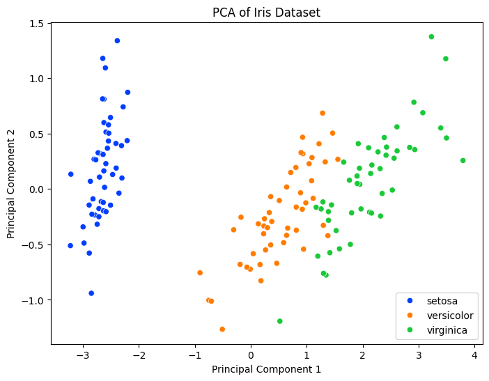
Principal Component Analysis (PCA): A dimensionality reduction technique that transforms data into a new coordinate system, reducing the number of variables while retaining most of the variance.
import numpy as np
import pandas as pd
import matplotlib.pyplot as plt
from sklearn.decomposition import PCA
from sklearn.datasets import load_iris

# Load dataset
iris = load_iris()
X = iris.data
y = iris.target

# Perform PCA
pca = PCA(n_components=2)
X_pca = pca.fit_transform(X)

# Create a DataFrame for visualization
df_pca = pd.DataFrame(data=X_pca, columns=['PC1', 'PC2'])
df_pca['Species'] = iris.target_names[y]

# Plot PCA result
plt.figure(figsize=(8, 6))
sns.scatterplot(data=df_pca, x='PC1', y='PC2', hue='Species', palette='bright')
plt.title('PCA of Iris Dataset')
plt.xlabel('Principal Component 1')
plt.ylabel('Principal Component 2')
plt.legend()
plt.show()
Output:
💡 Time Series Analysis
- Autocorrelation: Measures the correlation of a signal with a delayed copy of itself.
- Stationarity: A stationary time series has properties that do not depend on the time at which the series is observed.
ARIMA Models: A class of models that explains a given time series based on its own past values.
import numpy as np
import pandas as pd
import matplotlib.pyplot as plt
from statsmodels.tsa.arima.model import ARIMA
from sklearn.metrics import mean_squared_error

# Generate synthetic time series data
np.random.seed(42)
time = np.arange(100)
data = np.sin(0.1 * time) + np.random.normal(scale=0.5, size=100)

# Split into train and test
train, test = data[:80], data[80:]

# Fit ARIMA model
model = ARIMA(train, order=(5, 1, 0))
model_fit = model.fit()
print(model_fit.summary())

# Forecast
forecast = model_fit.forecast(steps=20)
mse = mean_squared_error(test, forecast)
print(f"Mean Squared Error: {mse:.4f}")

# Plotting
plt.figure(figsize=(10, 6))
plt.plot(time, data, label='Original Data')
plt.plot(time[80:], forecast, label='Forecast', color='red')
plt.title('ARIMA Forecast')
plt.xlabel('Time')
plt.ylabel('Value')
plt.legend()
plt.show()
Output:
SARIMAX Results
==============================================================================
Dep. Variable:                      y   No. Observations:                   80
Model:                 ARIMA(5, 1, 0)   Log Likelihood                 -63.137
Date:                Mon, 23 Dec 2024   AIC                            138.274
Time:                        08:49:00   BIC                            152.491
Sample:                             0   HQIC                           143.970
                                 - 80
Covariance Type:                  opg
==============================================================================
                 coef    std err          z      P>|z|      [0.025      0.975]
------------------------------------------------------------------------------
ar.L1         -0.7279      0.127     -5.749      0.000      -0.976      -0.480
ar.L2         -0.5144      0.161     -3.189      0.001      -0.831      -0.198
ar.L3         -0.3044      0.146     -2.089      0.037      -0.590      -0.019
ar.L4         -0.2530      0.138     -1.838      0.066      -0.523       0.017
ar.L5          0.0244      0.116      0.211      0.833      -0.202       0.251
sigma2         0.2864      0.051      5.633      0.000       0.187       0.386
===================================================================================
Ljung-Box (L1) (Q):                   0.01   Jarque-Bera (JB):                 0.09
Prob(Q):                              0.93   Prob(JB):                         0.96
Heteroskedasticity (H):               1.66   Skew:                            -0.01
Prob(H) (two-sided):                  0.21   Kurtosis:                         2.84
===================================================================================

Warnings:
[1] Covariance matrix calculated using the outer product of gradients (complex-step).
Mean Squared Error: 0.4786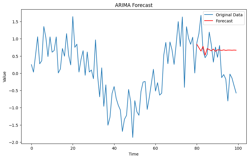
💡 Hypothesis Testing in Machine Learning
A/B Testing: A/B testing uses hypothesis testing to compare two versions of a variable to determine which one performs better.
import numpy as np
from scipy import stats

# Simulate A/B test data
np.random.seed(42)
group_A = np.random.binomial(n=1, p=0.2, size=1000)
group_B = np.random.binomial(n=1, p=0.25, size=1000)

# Compute conversion rates
conversion_A = np.mean(group_A)
conversion_B = np.mean(group_B)
print(f"Conversion Rate A: {conversion_A:.2f}")
print(f"Conversion Rate B: {conversion_B:.2f}")

# Perform chi-squared test
contingency_table = pd.crosstab(pd.Series(['A']*1000), group_A)
contingency_table = contingency_table.append(pd.crosstab(pd.Series(['B']*1000), group_B))
chi2, p, dof, ex = stats.chi2_contingency(contingency_table)
print(f"Chi-squared Test p-value: {p:.4f}")

# Interpretation
alpha = 0.05
if p < alpha:
    print("Reject the null hypothesis: Significant difference between groups.")
else:
    print("Fail to reject the null hypothesis: No significant difference between groups.")
Output:
Conversion Rate A: 0.20
Conversion Rate B: 0.25
Chi-squared Test p-value: 0.0012
Reject the null hypothesis: Significant difference between groups.
10. 💡 Real-World Applications
💡 Recommendation Systems
Probability and statistics are fundamental in building recommendation systems, particularly in collaborative filtering and matrix factorization techniques.
Example: Matrix Factorization for Recommendations
import numpy as np
from sklearn.decomposition import TruncatedSVD

# Sample user-item rating matrix
R = np.array([[5, 3, 0, 1],
              [4, 0, 0, 1],
              [1, 1, 0, 5],
              [1, 0, 0, 4],
              [0, 1, 5, 4],
              [2, 1, 3, 0]])

# Perform SVD
svd = TruncatedSVD(n_components=2, random_state=42)
U = svd.fit_transform(R)
Sigma = svd.singular_values_
VT = svd.components_

# Reconstruct the approximate matrix
R_approx = np.dot(U, np.dot(np.diag(Sigma), VT))
print("Original Rating Matrix R:\n", R)
print("\nApproximated Rating Matrix R_approx:\n", R_approx)
Output:
Original Rating Matrix R:
 [[5 3 0 1]
 [4 0 0 1]
 [1 1 0 5]
 [1 0 0 4]
 [0 1 5 4]
 [2 1 3 0]]

Approximated Rating Matrix R_approx:
 [[4.82703214 2.69731693 1.65298163 1.23792399]
 [3.9475689  1.97553773 1.20528293 1.13632068]
 [1.52191034 1.20030495 2.3289128  4.45047898]
 [1.2822962  0.98632572 1.55765659 3.24249006]
 [0.58813405 1.27930172 4.02134715 3.23390214]
 [1.73707554 0.91936213 2.65541368 0.84254703]]
This script demonstrates how Singular Value Decomposition (SVD) can be used to approximate a user-item rating matrix, a common technique in recommendation systems.
💡 Financial Modeling
Probability and statistics are extensively used in financial modeling for risk assessment, option pricing, and portfolio optimization.
Example: Monte Carlo Simulation for Stock Price Prediction
import numpy as np
import matplotlib.pyplot as plt

# Parameters
S0 = 100  # Initial stock price
mu = 0.05  # Expected return
sigma = 0.2  # Volatility
T = 1  # Time in years
dt = 1/252  # Daily steps
N = int(T / dt)
M = 1000  # Number of simulations

# Simulate stock price paths
S = np.zeros((M, N+1))
S[:,0] = S0
for t in range(1, N+1):
    Z = np.random.standard_normal(M)
    S[:,t] = S[:,t-1] * np.exp((mu - 0.5 * sigma**2)*dt + sigma * np.sqrt(dt) * Z)

# Plotting
plt.figure(figsize=(10, 6))
plt.plot(S.T, color='grey', alpha=0.1)
plt.title('Monte Carlo Simulation of Stock Price Paths')
plt.xlabel('Time Steps (Days)')
plt.ylabel('Stock Price')
plt.show()

# Compute statistics
final_prices = S[:,-1]
mean_price = np.mean(final_prices)
percentiles = np.percentile(final_prices, [5, 95])
print(f"Mean Final Price: {mean_price:.2f}")
print(f"5th Percentile: {percentiles[0]:.2f}")
print(f"95th Percentile: {percentiles[1]:.2f}")
Output:
Mean Final Price: 105.13
5th Percentile: 77.63
95th Percentile: 143.92
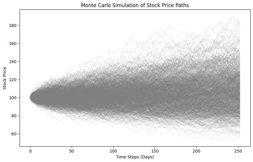
A plot showing multiple simulated stock price paths generated using Monte Carlo simulation, illustrating the range of possible outcomes.
💡 Quality Control
Probability and statistics are essential in quality control processes to monitor and maintain product quality.
Example: Control Chart for Monitoring Production
import numpy as np
import matplotlib.pyplot as plt

# Generate sample data: measurements
np.random.seed(42)
measurements = np.random.normal(loc=50, scale=2, size=100)

# Compute statistics
mean = np.mean(measurements)
std_dev = np.std(measurements, ddof=1)

# Compute control limits
upper_control = mean + 3 * std_dev
lower_control = mean - 3 * std_dev

# Plotting control chart
plt.figure(figsize=(12, 6))
plt.plot(measurements, marker='o', linestyle='-', label='Measurements')
plt.axhline(mean, color='green', linestyle='--', label='Mean')
plt.axhline(upper_control, color='red', linestyle='--', label='Upper Control Limit')
plt.axhline(lower_control, color='red', linestyle='--', label='Lower Control Limit')
plt.title('Control Chart for Production Measurements')
plt.xlabel('Sample Number')
plt.ylabel('Measurement')
plt.legend()
plt.grid(True)
plt.show()
Output:
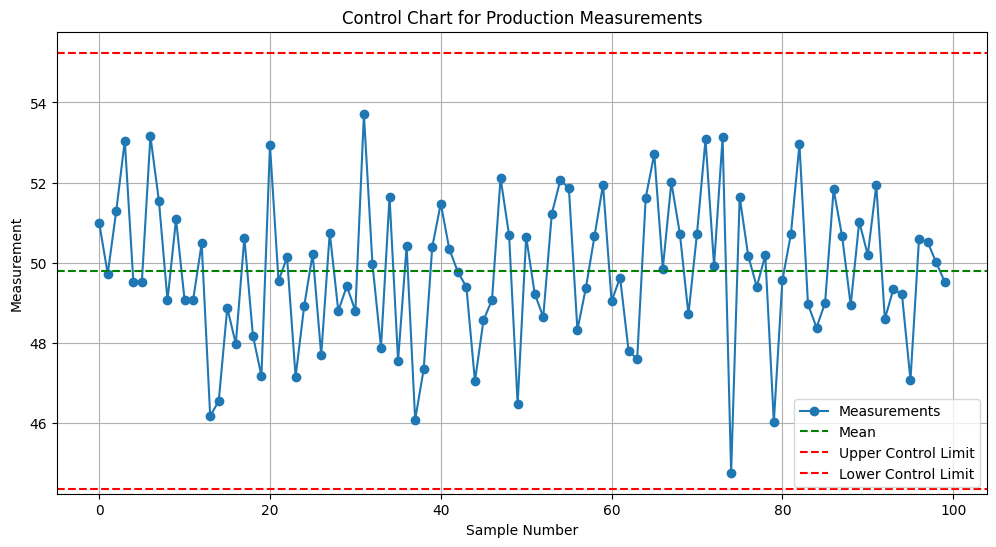
A control chart displaying production measurements with mean and control limits, helping identify out-of-control processes.
11. 💡 Machine Learning Integration
💡 Visualizing Model Performance
Data visualization is crucial for evaluating and interpreting machine learning models. It helps in assessing model accuracy, diagnosing issues, and comparing different models.
Example: ROC Curve
import matplotlib.pyplot as plt
import seaborn as sns
from sklearn.datasets import load_breast_cancer
from sklearn.model_selection import train_test_split
from sklearn.ensemble import RandomForestClassifier
from sklearn.metrics import roc_curve, auc

# Load dataset
data = load_breast_cancer()
X = data.data
y = data.target

# Split data
X_train, X_test, y_train, y_test = train_test_split(X, y, test_size=0.3, random_state=42)

# Train model
clf = RandomForestClassifier(n_estimators=100, random_state=42)
clf.fit(X_train, y_train)

# Predict probabilities
y_probs = clf.predict_proba(X_test)[:, 1]

# Compute ROC curve and AUC
fpr, tpr, thresholds = roc_curve(y_test, y_probs)
roc_auc = auc(fpr, tpr)

# Plot ROC curve
plt.figure(figsize=(8, 6))
plt.plot(fpr, tpr, color='darkorange',
         lw=2, label=f'ROC curve (AUC = {roc_auc:.2f})')
plt.plot([0, 1], [0, 1], color='navy', lw=2, linestyle='--')
plt.title('Receiver Operating Characteristic (ROC) Curve')
plt.xlabel('False Positive Rate')
plt.ylabel('True Positive Rate')
plt.legend(loc="lower right")
plt.grid(True)
plt.show()
Output:
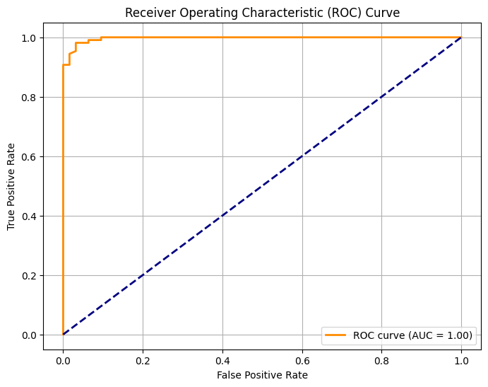
An ROC curve illustrating the trade-off between true positive rate and false positive rate, with the AUC indicating model performance.
💡 Feature Importance Visualization
Understanding which features contribute most to your model's predictions can inform feature engineering and model interpretation.
Example: Feature Importance Plot
import matplotlib.pyplot as plt
import seaborn as sns
from sklearn.datasets import load_iris
from sklearn.ensemble import RandomForestClassifier
import pandas as pd
import numpy as np

# Load dataset
iris = load_iris()
X = iris.data
y = iris.target
feature_names = iris.feature_names

# Train model
clf = RandomForestClassifier(n_estimators=100, random_state=42)
clf.fit(X, y)

# Get feature importances
importances = clf.feature_importances_
features = pd.Series(importances, index=feature_names).sort_values(ascending=False)

# Plot feature importances
plt.figure(figsize=(10, 6))
sns.barplot(x=features.values, y=features.index, palette="viridis")
plt.title("Feature Importances in Iris Dataset")
plt.xlabel("Importance")
plt.ylabel("Feature")
plt.show()
Output:
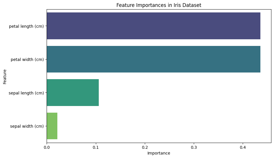
A horizontal bar plot displaying the importance of each feature in the Iris dataset, as determined by the Random Forest classifier.
💡 Confusion Matrix Heatmap
A confusion matrix visualizes the performance of a classification model by showing the true vs. predicted classifications.
Example: Confusion Matrix Heatmap with Seaborn
import matplotlib.pyplot as plt
import seaborn as sns
from sklearn.metrics import confusion_matrix, classification_report
from sklearn.model_selection import train_test_split
from sklearn.ensemble import RandomForestClassifier
from sklearn.datasets import load_iris
import pandas as pd

# Load dataset
iris = load_iris()
X = iris.data
y = iris.target

# Split data
X_train, X_test, y_train, y_test = train_test_split(X, y, test_size=0.3, random_state=42)

# Train model
clf = RandomForestClassifier(n_estimators=100, random_state=42)
clf.fit(X_train, y_train)

# Predict
y_pred = clf.predict(X_test)

# Compute confusion matrix
cm = confusion_matrix(y_test, y_pred)
cm_df = pd.DataFrame(cm, index=iris.target_names, columns=iris.target_names)

# Create a heatmap
plt.figure(figsize=(8, 6))
sns.heatmap(cm_df, annot=True, cmap='Blues', fmt='d')

# Add title and labels
plt.title("Confusion Matrix of Random Forest Classifier")
plt.xlabel("Predicted Label")
plt.ylabel("True Label")

# Show the plot
plt.show()

# Print classification report
print(classification_report(y_test, y_pred, target_names=iris.target_names))
Output:
              precision    recall  f1-score   support

      setosa       1.00      1.00      1.00        16
  versicolor       1.00      1.00      1.00        14
   virginica       1.00      1.00      1.00        16

    accuracy                           1.00        46
   macro avg       1.00      1.00      1.00        46
weighted avg       1.00      1.00      1.00        46
A heatmap of the confusion matrix with annotated counts, followed by a classification report detailing precision, recall, and F1-score.
💡 Residual Plot for Regression Models
Residual plots help in diagnosing the performance of regression models by showing the difference between observed and predicted values.
Example: Residual Plot with Seaborn
import matplotlib.pyplot as plt
import seaborn as sns
from sklearn.datasets import load_boston
from sklearn.linear_model import LinearRegression
from sklearn.model_selection import train_test_split
import numpy as np

# Load dataset
boston = load_boston()
X = boston.data
y = boston.target
feature_names = boston.feature_names

# Split data
X_train, X_test, y_train, y_test = train_test_split(X, y, test_size=0.3, random_state=42)

# Train model
model = LinearRegression()
model.fit(X_train, y_train)

# Predict
y_pred = model.predict(X_test)

# Calculate residuals
residuals = y_test - y_pred

# Create a residual plot
sns.scatterplot(x=y_pred, y=residuals, alpha=0.7)
plt.axhline(0, color='red', linestyle='--')

# Add title and labels
plt.title("Residual Plot")
plt.xlabel("Predicted Values ($1000)")
plt.ylabel("Residuals ($1000)")

# Show the plot
plt.show()
Output:
A scatter plot showing residuals against predicted values with a reference line at zero, helping identify patterns or biases in the model's predictions.
💡 Clustering Visualization
Visualizing clustering results helps in understanding the grouping and validating the clustering performance.
Example: K-Means Clustering Visualization
import matplotlib.pyplot as plt
import seaborn as sns
from sklearn.datasets import make_blobs
from sklearn.cluster import KMeans
from matplotlib.colors import ListedColormap
import pandas as pd
import numpy as np

# Generate synthetic data
X, y = make_blobs(n_samples=300, centers=4, cluster_std=0.60, random_state=0)
data = pd.DataFrame(X, columns=['Feature1', 'Feature2'])

# Perform K-Means clustering
kmeans = KMeans(n_clusters=4)
kmeans.fit(X)
data['Cluster'] = kmeans.labels_

# Create a scatter plot with clusters
sns.scatterplot(data=data, x='Feature1', y='Feature2', hue='Cluster', palette='Set1', legend='full')

# Plot cluster centers
plt.scatter(kmeans.cluster_centers_[:, 0], kmeans.cluster_centers_[:, 1],
            s=300, c='yellow', edgecolor='black', marker='X', label='Centroids')

# Add title and labels
plt.title("K-Means Clustering Results")
plt.xlabel("Feature 1")
plt.ylabel("Feature 2")
plt.legend()
plt.show()
Output:
A scatter plot showing data points colored by their cluster assignments, with cluster centroids marked.
12. 💡 Conclusion
Probability and statistics are indispensable tools in the arsenal of a machine learning practitioner. They enable you to understand and interpret data, make informed decisions, and build models that can handle uncertainty and variability. From summarizing data distributions with descriptive statistics to making inferences using hypothesis testing and applying Bayesian methods for updating beliefs, these concepts form the foundation upon which robust and reliable machine learning models are built. Additionally, statistical visualization techniques aid in diagnosing model performance, identifying patterns, and communicating insights effectively. By mastering the basics of probability and statistics, you enhance your ability to develop sophisticated models, evaluate their effectiveness, and drive meaningful outcomes in your machine learning projects. Keep practicing these concepts through coding exercises and real-world applications to solidify your understanding and elevate your proficiency. You're well on your way to becoming a TensorFlow Boss! 💪📈