Day 07: Data Visualization with Matplotlib and Seaborn
📑 Table of Contents
- 🌟 Welcome to Day 7
- 📚 Introduction to Data Visualization
- Why Data Visualization?
- Overview of Matplotlib and Seaborn
- Installing Visualization Libraries
- 🧩 Core Concepts
- Matplotlib Basics
- Seaborn Basics
- Customizing Plots
- Plot Types and When to Use Them
- 💻 Hands-On Coding
- Example Scripts
- 🧩 Interactive Exercises
- 📚 Resources
- 💡 Tips and Tricks
- 💡 Best Practices
- 💡 Advanced Topics
- 💡 Real-World Applications
- 💡 Machine Learning Integration
- 💡 Conclusion
1. 🌟 Welcome to Day 7
Welcome to Day 7 of "Becoming a Scikit-Learn Boss in 90 Days"! 🎉 Today, we dive into the vibrant world of Data Visualization using two of the most powerful Python libraries: Matplotlib and Seaborn. Visualization is a critical step in the data analysis process, allowing you to uncover patterns, identify trends, and communicate insights effectively. By the end of today, you'll be equipped to create compelling visual representations of your data, enhancing both your analytical skills and your ability to present findings clearly. Let's get started! 🚀
2. 📚 Introduction to Data Visualization
Why Data Visualization?
Data visualization transforms complex data sets into visual graphics, making it easier to understand, interpret, and derive actionable insights. Effective visualization can:
- Highlight Patterns and Trends: Spot correlations, outliers, and trends that might be missed in raw data.
- Simplify Complex Information: Break down intricate data into digestible visuals.
- Facilitate Decision-Making: Provide a clear basis for informed decisions.
- Enhance Communication: Convey findings effectively to stakeholders with varying levels of technical expertise.
Overview of Matplotlib and Seaborn
Matplotlib is the foundational plotting library in Python, offering extensive customization and control over plot elements. It's highly versatile and serves as the backbone for many other visualization libraries.
Seaborn builds on Matplotlib, providing a high-level interface for creating attractive and informative statistical graphics. It simplifies complex visualizations and integrates seamlessly with Pandas data structures.
Key Differences:
- Matplotlib:
- Offers fine-grained control over plot elements.
- Suitable for creating a wide variety of static, animated, and interactive plots.
- Requires more code for complex visualizations.
- Seaborn:
- Simplifies the creation of complex, aesthetically pleasing statistical plots.
- Integrates well with Pandas for handling DataFrame objects.
- Provides built-in themes and color palettes for enhanced visuals.
Installing Visualization Libraries
If you haven't installed Matplotlib and Seaborn yet, you can do so using pip:
pip install matplotlib seaborn
Or, if you're using Anaconda:
conda install matplotlib seaborn
3. 🧩 Core Concepts
🖼️ Matplotlib Basics
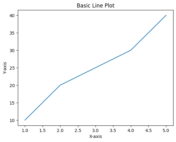
Matplotlib's primary plotting interface is the pyplot module, which provides functions for creating various types of plots.
Basic Plot Structure:
import matplotlib.pyplot as plt

# Sample data
x = [1, 2, 3, 4, 5]
y = [10, 20, 25, 30, 40]

# Create a plot
plt.plot(x, y)

# Add title and labels
plt.title("Basic Line Plot")
plt.xlabel("X-axis")
plt.ylabel("Y-axis")

# Show the plot
plt.show()
Output:
Key Components:
- Figure: The entire window where plots appear.
- Axes: The area where data is plotted (includes x and y axes).
- Axis: The x or y axis itself.
- Plot Elements: Lines, markers, labels, titles, legends, etc.
🖼️ Seaborn Basics
Seaborn simplifies complex plots and enhances the aesthetics of visualizations.
Basic Seaborn Plot:
import seaborn as sns
import matplotlib.pyplot as plt

# Sample data using Seaborn's built-in dataset
tips = sns.load_dataset("tips")

# Create a scatter plot
sns.scatterplot(data=tips, x="total_bill", y="tip", hue="day")

# Add title
plt.title("Total Bill vs Tip by Day")

# Show the plot
plt.show()
Output:
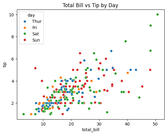
Key Features:
- Built-in Themes: Seaborn provides several themes (e.g., darkgrid, whitegrid) to enhance plot aesthetics.
- Color Palettes: Easily apply color palettes to differentiate data categories.
- Statistical Plots: Simplify the creation of complex statistical visualizations like violin plots, box plots, and heatmaps.
🎨 Customizing Plots
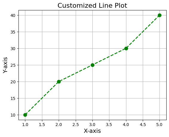
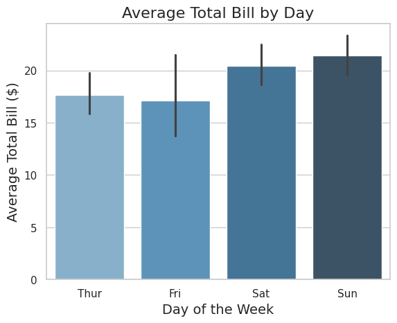
Both Matplotlib and Seaborn offer extensive customization options to tailor your visualizations to your needs.
Matplotlib Customizations:
import matplotlib.pyplot as plt

# Sample data
x = [1, 2, 3, 4, 5]
y = [10, 20, 25, 30, 40]

# Create a plot with customization
plt.plot(x, y, color='green', linestyle='--', marker='o', linewidth=2, markersize=8)

# Add title and labels with custom font sizes
plt.title("Customized Line Plot", fontsize=16)
plt.xlabel("X-axis", fontsize=14)
plt.ylabel("Y-axis", fontsize=14)

# Add grid
plt.grid(True)

# Show the plot
plt.show()
Output:
Seaborn Customizations:
import seaborn as sns
import matplotlib.pyplot as plt

# Sample data
tips = sns.load_dataset("tips")

# Set Seaborn theme
sns.set_theme(style="whitegrid")

# Create a bar plot with custom palette and labels
sns.barplot(data=tips, x="day", y="total_bill", palette="Blues_d")

# Add title and labels
plt.title("Average Total Bill by Day", fontsize=16)
plt.xlabel("Day of the Week", fontsize=14)
plt.ylabel("Average Total Bill ($)", fontsize=14)

# Show the plot
plt.show()
Output:
📈 Plot Types and When to Use Them
Understanding different plot types and their appropriate use cases is crucial for effective data visualization.
| Plot Type | Description | When to Use |
|---|---|---|
| Line Plot | Shows trends over continuous data. | Time series data, trend analysis. |
| Bar Plot | Compares quantities across categories. | Comparing groups or categories. |
| Scatter Plot | Displays relationship between two variables. | Correlation analysis, identifying clusters and outliers. |
| Histogram | Shows distribution of a single variable. | Understanding data distribution, skewness, kurtosis. |
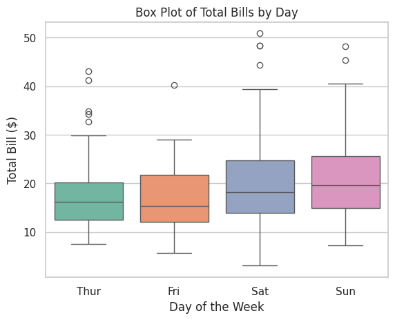
| Box Plot | Summarizes distribution with quartiles and outliers. | Comparing distributions across categories. |
| Heatmap | Visualizes matrix-like data with color coding. | Correlation matrices, feature interactions. |
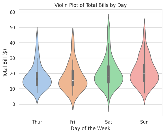
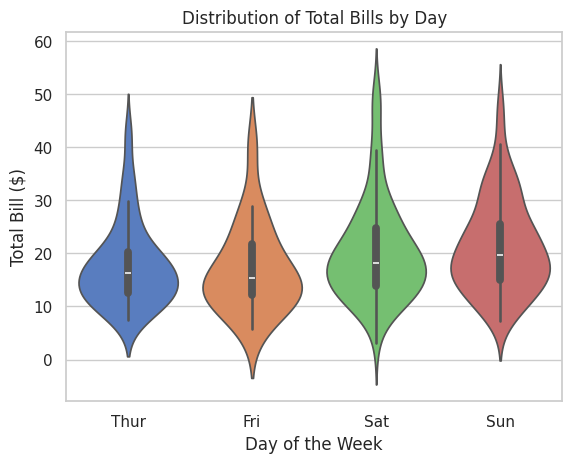
| Violin Plot | Combines box plot and KDE for distribution. | Comparing distributions with density information. |
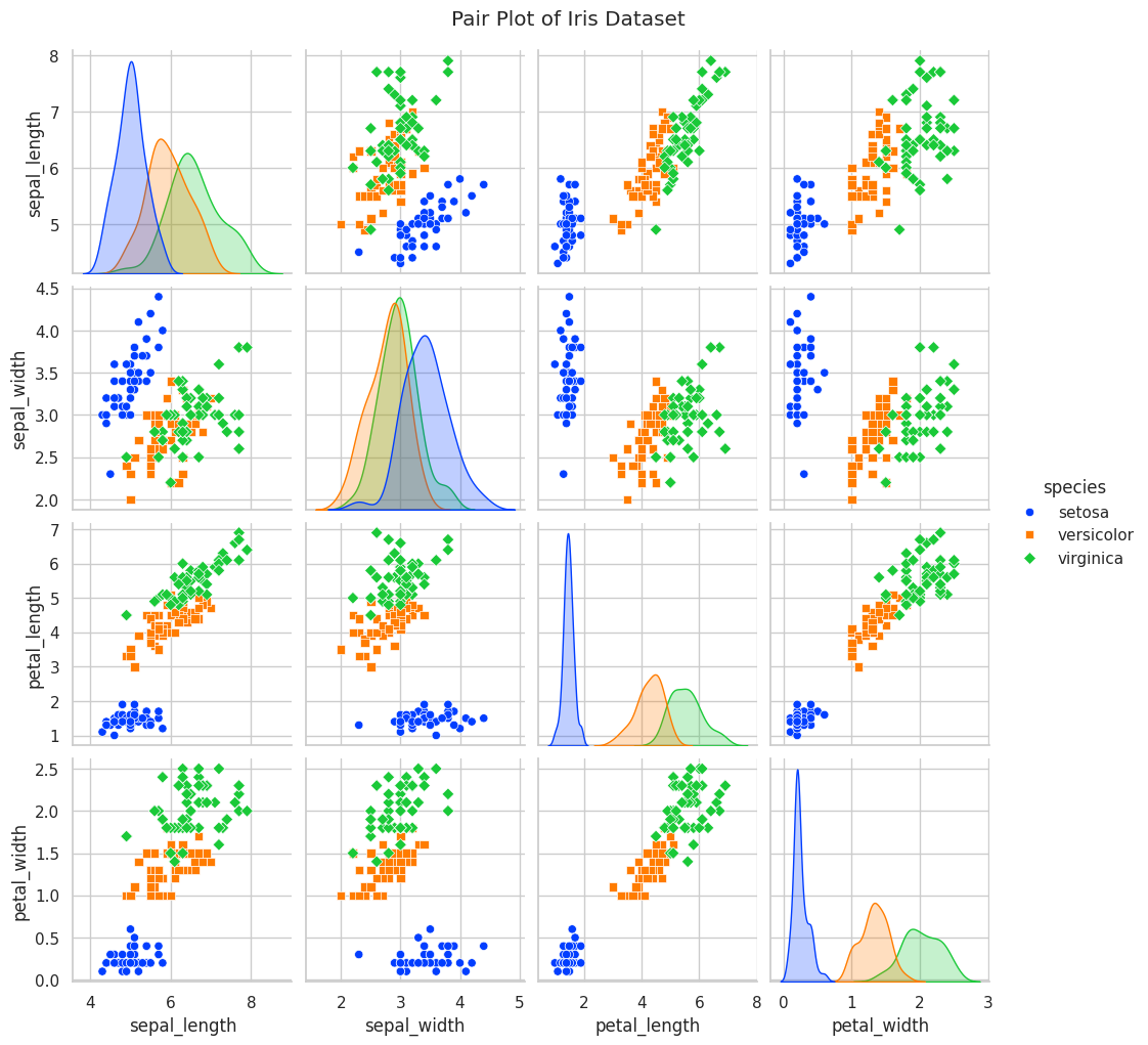
| Pair Plot | Creates scatter plots for all pairs of variables. | Exploratory data analysis to identify relationships. |
| Pie Chart | Represents proportions of a whole. | Showing percentage breakdowns (use sparingly). |
| Bubble Plot | Scatter plot with variable marker sizes. | Adding a third dimension to scatter plots. |
4. 💻 Hands-On Coding
🎉 Example Scripts
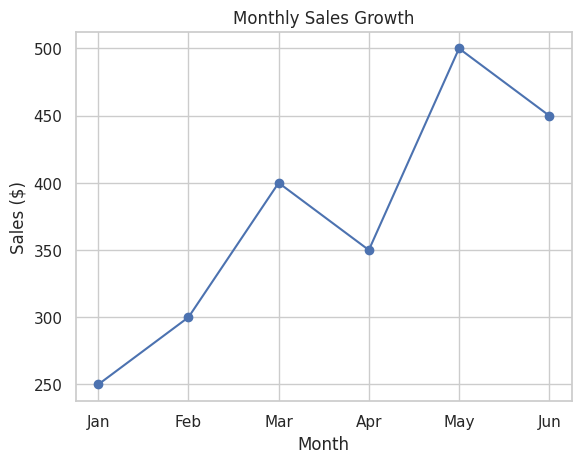
📝 Script 1: Basic Line Plot with Matplotlib
# basic_line_plot.py

import matplotlib.pyplot as plt

# Sample data
months = ['Jan', 'Feb', 'Mar', 'Apr', 'May', 'Jun']
sales = [250, 300, 400, 350, 500, 450]

# Create a line plot
plt.plot(months, sales, marker='o', linestyle='-', color='b')

# Add title and labels
plt.title("Monthly Sales Growth")
plt.xlabel("Month")
plt.ylabel("Sales ($)")

# Add grid
plt.grid(True)

# Show the plot
plt.show()
Output:
📝 Script 2: Scatter Plot with Seaborn
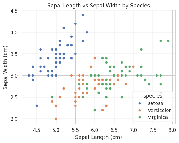
# scatter_plot_seaborn.py

import seaborn as sns
import matplotlib.pyplot as plt

# Load the Iris dataset
iris = sns.load_dataset("iris")

# Create a scatter plot
sns.scatterplot(data=iris, x="sepal_length", y="sepal_width", hue="species", palette="deep")

# Add title and labels
plt.title("Sepal Length vs Sepal Width by Species")
plt.xlabel("Sepal Length (cm)")
plt.ylabel("Sepal Width (cm)")

# Show the plot
plt.show()
Output:
📝 Script 3: Bar Plot with Matplotlib
# bar_plot_matplotlib.py

import matplotlib.pyplot as plt

# Sample data
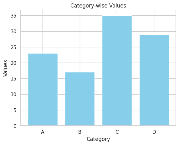
categories = ['A', 'B', 'C', 'D']
values = [23, 17, 35, 29]

# Create a bar plot
plt.bar(categories, values, color='skyblue')

# Add title and labels
plt.title("Category-wise Values")
plt.xlabel("Category")
plt.ylabel("Values")

# Show the plot
plt.show()
Output:
📝 Script 4: Histogram with Seaborn
# histogram_seaborn.py

import seaborn as sns
import matplotlib.pyplot as plt

# Load the Tips dataset
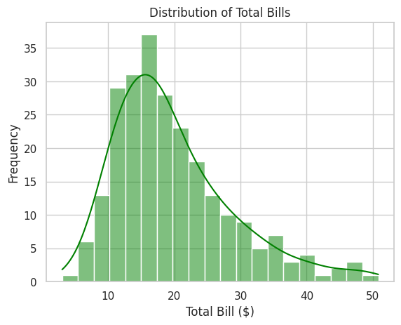
tips = sns.load_dataset("tips")

# Create a histogram
sns.histplot(tips['total_bill'], bins=20, kde=True, color='green')

# Add title and labels
plt.title("Distribution of Total Bills")
plt.xlabel("Total Bill ($)")
plt.ylabel("Frequency")

# Show the plot
plt.show()
Output:
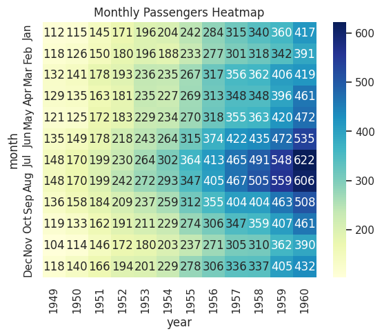
📝 Script 5: Heatmap with Seaborn
# heatmap_seaborn.py

import seaborn as sns
import matplotlib.pyplot as plt

# Load the Flights dataset
flights = sns.load_dataset("flights")
flights_pivot = flights.pivot(index="month", columns="year", values="passengers")

# Create a heatmap
sns.heatmap(flights_pivot, annot=True, fmt="d", cmap="YlGnBu")

# Add title
plt.title("Monthly Passengers Heatmap")

# Show the plot
plt.show()
Output:
📝 Script 6: Box Plot with Seaborn
# box_plot_seaborn.py

import seaborn as sns
import matplotlib.pyplot as plt

# Load the Tips dataset
tips = sns.load_dataset("tips")

# Create a box plot
sns.boxplot(x="day", y="total_bill", data=tips, palette="Set2")

# Add title and labels
plt.title("Box Plot of Total Bills by Day")
plt.xlabel("Day of the Week")
plt.ylabel("Total Bill ($)")

# Show the plot
plt.show()
Output:
📝 Script 7: Pair Plot with Seaborn
# pair_plot_seaborn.py

import seaborn as sns
import matplotlib.pyplot as plt

# Load the Iris dataset
iris = sns.load_dataset("iris")

# Create a pair plot
sns.pairplot(iris, hue="species", markers=["o", "s", "D"], palette="bright")

# Add title
plt.suptitle("Pair Plot of Iris Dataset", y=1.02)

# Show the plot
plt.show()
Output:

📝 Script 8: Violin Plot with Seaborn
# violin_plot_seaborn.py

import seaborn as sns
import matplotlib.pyplot as plt

# Load the Tips dataset
tips = sns.load_dataset("tips")

# Create a violin plot
sns.violinplot(x="day", y="total_bill", data=tips, palette="pastel")

# Add title and labels
plt.title("Violin Plot of Total Bills by Day")
plt.xlabel("Day of the Week")
plt.ylabel("Total Bill ($)")

# Show the plot
plt.show()
Output:
5. 🧩 Interactive Exercises
📝 Exercise 1: Creating a Basic Line Plot with Matplotlib
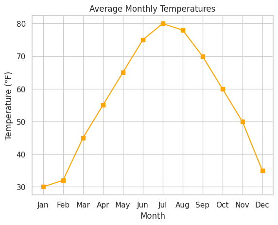
Task: Create a line plot showing the average monthly temperatures for a year.
import matplotlib.pyplot as plt

# Sample data
months = ['Jan', 'Feb', 'Mar', 'Apr', 'May', 'Jun',
          'Jul', 'Aug', 'Sep', 'Oct', 'Nov', 'Dec']
temperatures = [30, 32, 45, 55, 65, 75,
                80, 78, 70, 60, 50, 35]

# Create a line plot
plt.plot(months, temperatures, marker='s', linestyle='-', color='orange')

# Add title and labels
plt.title("Average Monthly Temperatures")
plt.xlabel("Month")
plt.ylabel("Temperature (°F)")

# Add grid
plt.grid(True)

# Show the plot
plt.show()
Expected Output:
📝 Exercise 2: Creating a Scatter Plot with Seaborn
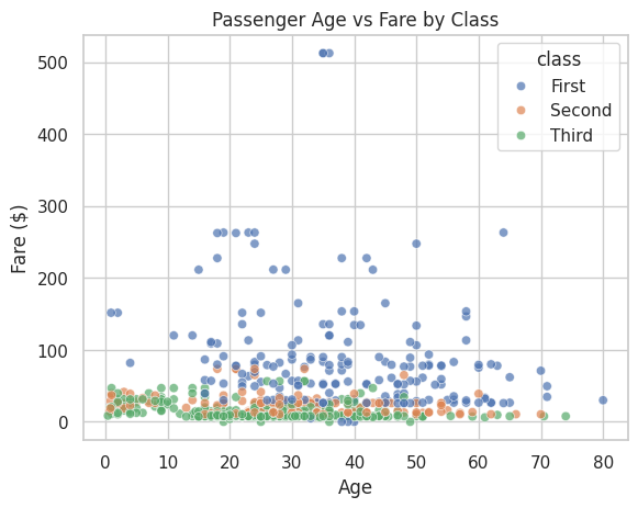
Task: Using the Titanic dataset, create a scatter plot showing the relationship between passenger age and fare, colored by passenger class.
import seaborn as sns
import matplotlib.pyplot as plt

# Load the Titanic dataset
titanic = sns.load_dataset("titanic")

# Drop rows with missing values in 'age' or 'fare'
titanic_clean = titanic.dropna(subset=['age', 'fare'])

# Create a scatter plot
sns.scatterplot(data=titanic_clean, x="age", y="fare", hue="class", palette="deep", alpha=0.7)

# Add title and labels
plt.title("Passenger Age vs Fare by Class")
plt.xlabel("Age")
plt.ylabel("Fare ($)")

# Show the plot
plt.show()
Expected Output:
📝 Exercise 3: Creating a Bar Plot with Matplotlib
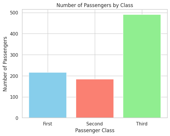
Task: Visualize the number of passengers in each passenger class using a bar plot.
import matplotlib.pyplot as plt
import seaborn as sns

# Load the Titanic dataset
titanic = sns.load_dataset("titanic")

# Count passengers in each class
class_counts = titanic['class'].value_counts().sort_index()

# Create a bar plot
plt.bar(class_counts.index, class_counts.values, color=['skyblue', 'salmon', 'lightgreen'])

# Add title and labels
plt.title("Number of Passengers by Class")
plt.xlabel("Passenger Class")
plt.ylabel("Number of Passengers")

# Show the plot
plt.show()
Expected Output:
📝 Exercise 4: Creating a Heatmap with Seaborn
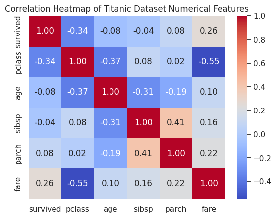
Task: Using the Titanic dataset, create a heatmap to visualize the correlation between numerical variables.
import seaborn as sns
import matplotlib.pyplot as plt

# Load the Titanic dataset
titanic = sns.load_dataset("titanic")

# Select numerical columns
numerical_cols = titanic.select_dtypes(include=['float64', 'int64'])

# Compute the correlation matrix
corr_matrix = numerical_cols.corr()

# Create a heatmap
sns.heatmap(corr_matrix, annot=True, cmap="coolwarm", fmt=".2f")

# Add title
plt.title("Correlation Heatmap of Titanic Dataset Numerical Features")

# Show the plot
plt.show()
Expected Output:
📝 Exercise 5: Creating a Box Plot with Seaborn
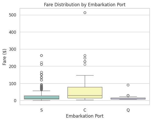
Task: Visualize the distribution of fares paid by passengers across different embarkation ports.
import seaborn as sns
import matplotlib.pyplot as plt

# Load the Titanic dataset
titanic = sns.load_dataset("titanic")

# Drop rows with missing values in 'fare' or 'embarked'
titanic_clean = titanic.dropna(subset=['fare', 'embarked'])

# Create a box plot
sns.boxplot(x="embarked", y="fare", data=titanic_clean, palette="Set3")

# Add title and labels
plt.title("Fare Distribution by Embarkation Port")
plt.xlabel("Embarkation Port")
plt.ylabel("Fare ($)")

# Show the plot
plt.show()
Expected Output:
📝 Exercise 6: Creating a Pair Plot with Seaborn
Task: Using the Iris dataset, create a pair plot to explore the relationships between different features.
import seaborn as sns
import matplotlib.pyplot as plt

# Load the Iris dataset
iris = sns.load_dataset("iris")

# Create a pair plot
sns.pairplot(iris, hue="species", markers=["o", "s", "D"], palette="bright")

# Add title
plt.suptitle("Pair Plot of Iris Dataset", y=1.02)

# Show the plot
plt.show()
Expected Output:
📝 Exercise 7: Creating a Violin Plot with Seaborn
Task: Using the Tips dataset, create a violin plot to visualize the distribution of total bills for each day of the week.
import seaborn as sns
import matplotlib.pyplot as plt

# Load the Tips dataset
tips = sns.load_dataset("tips")

# Create a violin plot
sns.violinplot(x="day", y="total_bill", data=tips, palette="muted")

# Add title and labels
plt.title("Distribution of Total Bills by Day")
plt.xlabel("Day of the Week")
plt.ylabel("Total Bill ($)")

# Show the plot
plt.show()
Expected Output:
6. 📚 Resources
Enhance your visualization skills with these excellent resources:
- Matplotlib Official Documentation
- Seaborn Official Documentation
- Matplotlib Tutorial by W3Schools
- Seaborn Tutorial by W3Schools
- Python Graph Gallery
- Real Python's Matplotlib Tutorials
- Real Python's Seaborn Tutorials
- DataCamp Visualization Courses
- Kaggle Visualization Tutorials
- YouTube - Corey Schafer's Matplotlib Series
7. 💡 Tips and Tricks
💡 Pro Tip
Leverage Seaborn's Built-in Themes: Seaborn offers various themes that enhance the aesthetics of your plots with minimal effort. Use sns.set_theme() to apply a theme globally.
import seaborn as sns

# Set a darkgrid theme
sns.set_theme(style="darkgrid")

# Now, all Seaborn plots will use the darkgrid style
🛠️ Recommended Tools
- Jupyter Notebook: Ideal for interactive data visualization and exploration.
- Visual Studio Code: A versatile code editor with excellent support for Matplotlib and Seaborn.
- PyCharm: An IDE with powerful features for Python development, including visualization support.
- Google Colab: An online Jupyter notebook environment that doesn't require setup.
- Tableau Public: For more advanced and interactive visualizations outside Python.
🚀 Speed Up Your Coding
Customize with Less Code: Utilize Seaborn's high-level interface to create complex plots with fewer lines of code compared to Matplotlib.
import seaborn as sns

# Create a complex plot with a single function
sns.lmplot(x="sepal_length", y="sepal_width", data=iris, hue="species", markers=["o", "s", "D"])
Explore Plotting Functions: Familiarize yourself with various plotting functions offered by Matplotlib and Seaborn to quickly create different types of visualizations.
import matplotlib.pyplot as plt
import seaborn as sns

# Line plot
plt.plot([1, 2, 3], [4, 5, 6])

# Scatter plot
sns.scatterplot(x=[1, 2, 3], y=[4, 5, 6])

# Histogram
sns.histplot([1, 2, 2, 3, 3, 3])

# Box plot
sns.boxplot(x=["A", "B", "C"], y=[1, 2, 3])
Use Pandas Integration: Seaborn works seamlessly with Pandas DataFrames. Take advantage of this integration to simplify data manipulation and plotting.
import seaborn as sns
import pandas as pd

# Load a dataset into a DataFrame
df = sns.load_dataset("tips")

# Create a plot directly from the DataFrame
sns.barplot(x="day", y="total_bill", data=df)
🔍 Debugging Tips
- Leverage Interactive Environments: Use Jupyter Notebook or Google Colab to interactively tweak and debug your plots in real-time.
Use Plot Inspection Tools: Utilize Matplotlib's debugging features to inspect plot elements and troubleshoot issues.
import matplotlib.pyplot as plt

# After creating a plot
fig, ax = plt.subplots()
ax.plot([1, 2, 3], [4, 5, 6])

# Inspect axis properties
print(ax.get_title())
print(ax.get_xlabel())
print(ax.get_ylabel())
Check Data Integrity: Ensure your data is clean and correctly formatted before plotting. Use Pandas functions like .info(), .describe(), and .head() to inspect your DataFrame.
import pandas as pd

df = pd.read_csv("data.csv")
print(df.info())
print(df.describe())
print(df.head())
8. 💡 Best Practices
💡 Choose the Right Plot Type
Selecting the appropriate visualization type is crucial for effectively conveying your message. Refer to the plot types and their use cases in the Core Concepts section to guide your choices.
💡 Keep It Simple
Avoid cluttering your plots with unnecessary elements. Focus on clarity and readability.
- Avoid Excessive Annotations: Only add annotations that enhance understanding.
Limit the Number of Colors: Use a consistent and limited color palette to avoid overwhelming the viewer.
import seaborn as sns

sns.set_palette("pastel")
💡 Use Consistent Styling
Maintain consistency in fonts, colors, and styles across multiple plots to create a cohesive visual narrative.
Define Custom Styles: Create custom styles for unique requirements.
import matplotlib.pyplot as plt

plt.style.use('ggplot')
Set Global Styles: Use sns.set_theme() to apply consistent themes across all your plots.
import seaborn as sns

sns.set_theme(style="whitegrid", palette="muted")
💡 Label Everything Clearly
Ensure that all axes, legends, and titles are clearly labeled to provide context.
Axis Labels: Specify units and descriptions.
plt.xlabel("Month")
plt.ylabel("Sales ($)")
Descriptive Titles: Clearly state what the plot represents.
plt.title("Average Monthly Sales by Region")
💡 Handle Overplotting
When dealing with large datasets, overplotting can obscure patterns. Use transparency (alpha), jitter, or alternative plot types to mitigate this.
import seaborn as sns
import matplotlib.pyplot as plt

# Scatter plot with transparency
sns.scatterplot(data=large_dataset, x="feature1", y="feature2", alpha=0.5)

plt.show()
9. 💡 Advanced Topics
💡 Interactive Plots with Matplotlib
Matplotlib supports interactive plots that can be embedded in applications or Jupyter Notebooks.
Example: Interactive Slider
import matplotlib.pyplot as plt
from matplotlib.widgets import Slider
import numpy as np

# Create initial data
x = np.linspace(0, 10, 100)
y = np.sin(x)

# Create plot
fig, ax = plt.subplots()
plt.subplots_adjust(bottom=0.25)
line, = ax.plot(x, y, lw=2)

# Add slider
ax_slider = plt.axes([0.2, 0.1, 0.65, 0.03])
slider = Slider(ax_slider, 'Freq', 0.1, 10.0, valinit=1.0)

# Update function
def update(val):
    freq = slider.val
    line.set_ydata(np.sin(freq * x))
    fig.canvas.draw_idle()

slider.on_changed(update)

# Show plot
plt.show()
Output:
# An interactive sine wave plot where the frequency can be adjusted using a slider.
💡 Facet Grids with Seaborn
Facet Grids allow you to create multiple plots based on categories in the data, facilitating comparison across subsets.
Example: Facet Grid with Seaborn
import seaborn as sns
import matplotlib.pyplot as plt

# Load the Tips dataset
tips = sns.load_dataset("tips")

# Create a FacetGrid
g = sns.FacetGrid(tips, col="time", row="sex", margin_titles=True)

# Map a scatter plot to each facet
g.map(sns.scatterplot, "total_bill", "tip")

# Add titles and adjust layout
plt.subplots_adjust(top=0.9)
g.fig.suptitle("Total Bill vs Tip by Time and Sex")

# Show the plot
plt.show()
Output:
# A grid of scatter plots showing the relationship between total bill and tip, separated by time of day and sex.
💡 Customizing Seaborn Themes
Seaborn allows for extensive customization of themes to match your desired aesthetic.
Example: Customizing Themes
import seaborn as sns
import matplotlib.pyplot as plt

# Set a custom theme
sns.set_theme(style="white", palette="muted", color_codes=True)

# Load a dataset
tips = sns.load_dataset("tips")

# Create a violin plot
sns.violinplot(x="day", y="total_bill", data=tips)

# Add title and labels
plt.title("Violin Plot with Custom Theme")
plt.xlabel("Day of the Week")
plt.ylabel("Total Bill ($)")

# Show the plot
plt.show()
Output:
# A violin plot styled with a white background and muted color palette.
💡 Integrating Matplotlib with Other Libraries
Combine Matplotlib with other libraries like Pandas, NumPy, and Scikit-Learn for enhanced data visualization capabilities.
Example: Plotting with Pandas
import pandas as pd
import matplotlib.pyplot as plt

# Create a DataFrame
df = pd.DataFrame({
    'Year': [2015, 2016, 2017, 2018, 2019],
    'Sales': [250, 300, 400, 350, 500]
})

# Plot using Pandas
df.plot(x='Year', y='Sales', kind='line', marker='o', color='purple')

# Add title and labels
plt.title("Annual Sales Growth")
plt.xlabel("Year")
plt.ylabel("Sales ($)")

# Show the plot
plt.show()
Output:
# A line plot showing annual sales growth from 2015 to 2019, created using Pandas' plotting interface.
10. 💡 Real-World Applications
💡 Business Intelligence Dashboards
Data visualization is a cornerstone of business intelligence (BI), enabling organizations to monitor key performance indicators (KPIs) and make data-driven decisions.
Example: Sales Dashboard Components
- Sales Over Time: Line plot showing sales trends.
- Sales by Region: Bar plot or heatmap displaying regional performance.
- Top Products: Bar plot highlighting best-selling products.
- Customer Demographics: Pie chart or scatter plot analyzing customer segments.
import matplotlib.pyplot as plt
import seaborn as sns
import pandas as pd

# Sample data
months = ['Jan', 'Feb', 'Mar', 'Apr', 'May', 'Jun']
sales = [250, 300, 400, 350, 500, 450]
regions = ['North', 'South', 'East', 'West']
region_sales = [150, 200, 250, 180]
products = ['Product A', 'Product B', 'Product C']
product_sales = [300, 400, 350]

# Create subplots
fig, axs = plt.subplots(2, 2, figsize=(12, 10))

# Sales Over Time
sns.lineplot(x=months, y=sales, marker='o', ax=axs[0, 0])
axs[0, 0].set_title("Sales Over Time")
axs[0, 0].set_xlabel("Month")
axs[0, 0].set_ylabel("Sales ($)")

# Sales by Region
sns.barplot(x=regions, y=region_sales, palette="Set2", ax=axs[0, 1])
axs[0, 1].set_title("Sales by Region")
axs[0, 1].set_xlabel("Region")
axs[0, 1].set_ylabel("Sales ($)")

# Top Products
sns.barplot(x=products, y=product_sales, palette="Set3", ax=axs[1, 0])
axs[1, 0].set_title("Top Products")
axs[1, 0].set_xlabel("Product")
axs[1, 0].set_ylabel("Sales ($)")

# Customer Demographics (Pie Chart)
axs[1, 1].pie([60, 25, 15], labels=['Young', 'Adult', 'Senior'], autopct='%1.1f%%', colors=['lightblue', 'lightgreen', 'lightcoral'])
axs[1, 1].set_title("Customer Demographics")

# Adjust layout
plt.tight_layout()
plt.show()
Output:
# A 2x2 dashboard with line plot, bar plots, and a pie chart showcasing different business metrics.
💡 Scientific Research and Reporting
In scientific research, clear and accurate visualizations are essential for presenting data findings, supporting hypotheses, and conveying results to the scientific community.
Example: Experimental Results Visualization
import seaborn as sns
import matplotlib.pyplot as plt
import pandas as pd

# Sample experimental data
data = {
    'Condition': ['Control', 'Control', 'Treatment', 'Treatment'],
    'Measurement': [23.5, 24.0, 30.2, 29.8]
}
df = pd.DataFrame(data)

# Create a box plot
sns.boxplot(x='Condition', y='Measurement', data=df, palette="Set1")

# Add title and labels
plt.title("Effect of Treatment on Measurement")
plt.xlabel("Condition")
plt.ylabel("Measurement Units")

# Show the plot
plt.show()
Output:
# A box plot comparing measurements under control and treatment conditions, highlighting the effect of the treatment.
💡 Healthcare Data Analysis
Visualizing healthcare data can uncover insights related to patient outcomes, disease prevalence, and treatment effectiveness.
Example: Disease Incidence Heatmap
import seaborn as sns
import matplotlib.pyplot as plt
import pandas as pd

# Sample data: Disease incidence per region and age group
data = {
    'Region': ['North', 'North', 'South', 'South', 'East', 'East', 'West', 'West'],
    'Age_Group': ['0-18', '19-35', '0-18', '19-35', '0-18', '19-35', '0-18', '19-35'],
    'Incidence': [50, 120, 60, 130, 55, 110, 65, 140]
}
df = pd.DataFrame(data)
df_pivot = df.pivot("Region", "Age_Group", "Incidence")

# Create a heatmap
sns.heatmap(df_pivot, annot=True, cmap="Reds", fmt="d")

# Add title
plt.title("Disease Incidence by Region and Age Group")

# Show the plot
plt.show()
Output:
# A heatmap showing disease incidence across different regions and age groups with red color intensity.
💡 Financial Market Analysis
Visualizations can help analyze stock market trends, portfolio performance, and financial indicators.
Example: Stock Price Line Plot
import matplotlib.pyplot as plt
import pandas as pd
import numpy as np

# Sample stock price data
dates = pd.date_range(start='2024-01-01', periods=100, freq='D')
prices = np.random.lognormal(mean=0.001, sigma=0.02, size=100).cumprod() * 100
df = pd.DataFrame({'Date': dates, 'Price': prices})
df.set_index('Date', inplace=True)

# Plot stock prices
plt.figure(figsize=(12, 6))
plt.plot(df.index, df['Price'], color='blue', label='Stock Price')

# Add moving average
df['Moving_Avg_20'] = df['Price'].rolling(window=20).mean()
plt.plot(df.index, df['Moving_Avg_20'], color='red', label='20-Day Moving Average')

# Add title and labels
plt.title("Stock Price Over Time with 20-Day Moving Average")
plt.xlabel("Date")
plt.ylabel("Price ($)")
plt.legend()

# Show the plot
plt.show()
Output:
# A line plot showing stock prices over time with a 20-day moving average overlay.
11. 💡 Machine Learning Integration
💡 Visualizing Model Performance
Data visualization plays a pivotal role in evaluating and understanding machine learning models. Visual tools help in assessing model performance, diagnosing issues, and comparing different models.
Example: Confusion Matrix Visualization
import matplotlib.pyplot as plt
import seaborn as sns
from sklearn.metrics import confusion_matrix, ConfusionMatrixDisplay
from sklearn.model_selection import train_test_split
from sklearn.datasets import load_iris
from sklearn.ensemble import RandomForestClassifier

# Load dataset
iris = load_iris()
X = iris.data
y = iris.target

# Split data
X_train, X_test, y_train, y_test = train_test_split(X, y, random_state=42)

# Train model
clf = RandomForestClassifier()
clf.fit(X_train, y_train)

# Predict
y_pred = clf.predict(X_test)

# Compute confusion matrix
cm = confusion_matrix(y_test, y_pred, labels=clf.classes_)
disp = ConfusionMatrixDisplay(confusion_matrix=cm, display_labels=iris.target_names)

# Plot confusion matrix
disp.plot(cmap="Blues")
plt.title("Confusion Matrix of Random Forest Classifier")
plt.show()
Output:
# A confusion matrix displaying the performance of the Random Forest classifier on the Iris dataset.
💡 Feature Importance Visualization
Understanding which features contribute most to your model's predictions is essential for interpretability and feature engineering.
Example: Feature Importance Plot
import matplotlib.pyplot as plt
import seaborn as sns
from sklearn.datasets import load_boston
from sklearn.ensemble import RandomForestRegressor

# Load dataset
boston = load_boston()
X = boston.data
y = boston.target
feature_names = boston.feature_names

# Train model
model = RandomForestRegressor(random_state=42)
model.fit(X, y)

# Get feature importances
importances = model.feature_importances_
indices = np.argsort(importances)[::-1]

# Create a bar plot
plt.figure(figsize=(12, 6))
sns.barplot(x=importances[indices], y=feature_names[indices], palette="viridis")

# Add title and labels
plt.title("Feature Importances in Boston Housing Dataset")
plt.xlabel("Importance")
plt.ylabel("Feature")

# Show the plot
plt.show()
Output:
# A horizontal bar plot showing the importance of each feature in predicting housing prices.
💡 Visualizing Decision Boundaries
Visualizing decision boundaries helps in understanding how classification models partition the feature space.
Example: Decision Boundary Plot
import matplotlib.pyplot as plt
import numpy as np
from sklearn.datasets import load_iris
from sklearn.ensemble import RandomForestClassifier
from matplotlib.colors import ListedColormap

# Load dataset
iris = load_iris()
X = iris.data[:, :2]  # Use first two features for visualization
y = iris.target

# Train model
clf = RandomForestClassifier(n_estimators=100, random_state=42)
clf.fit(X, y)

# Define mesh grid
x_min, x_max = X[:, 0].min() - 1, X[:, 0].max() + 1
y_min, y_max = X[:, 1].min() - 1, X[:, 1].max() + 1
xx, yy = np.meshgrid(np.arange(x_min, x_max, 0.02),
                     np.arange(y_min, y_max, 0.02))

# Predict on mesh grid
Z = clf.predict(np.c_[xx.ravel(), yy.ravel()])
Z = Z.reshape(xx.shape)

# Define colors
cmap_light = ListedColormap(['#FFAAAA', '#AAFFAA', '#AAAAFF'])
cmap_bold = ListedColormap(['#FF0000', '#00FF00', '#0000FF'])

# Plot decision boundaries
plt.figure(figsize=(10, 6))
plt.contourf(xx, yy, Z, alpha=0.3, cmap=cmap_light)

# Plot training points
sns.scatterplot(x=X[:, 0], y=X[:, 1], hue=y, palette=cmap_bold, edgecolor="k")

# Add title and labels
plt.title("Decision Boundaries of Random Forest Classifier")
plt.xlabel("Sepal Length (cm)")
plt.ylabel("Sepal Width (cm)")

# Show the plot
plt.show()
Output:
# A plot showing the decision boundaries of the Random Forest classifier with data points overlaid.
💡 Residual Plots for Regression Analysis
Residual plots help in diagnosing the performance of regression models by showing the difference between observed and predicted values.
Example: Residual Plot
import matplotlib.pyplot as plt
import seaborn as sns
from sklearn.datasets import load_boston
from sklearn.linear_model import LinearRegression
from sklearn.model_selection import train_test_split

# Load dataset
boston = load_boston()
X = boston.data
y = boston.target

# Split data
X_train, X_test, y_train, y_test = train_test_split(X, y, random_state=42)

# Train model
model = LinearRegression()
model.fit(X_train, y_train)

# Predict
y_pred = model.predict(X_test)

# Calculate residuals
residuals = y_test - y_pred

# Create a residual plot
sns.scatterplot(x=y_pred, y=residuals, alpha=0.7)

# Add a horizontal line at zero
plt.axhline(0, color='red', linestyle='--')

# Add title and labels
plt.title("Residual Plot")
plt.xlabel("Predicted Values ($1000)")
plt.ylabel("Residuals ($1000)")

# Show the plot
plt.show()
Output:
# A scatter plot showing residuals against predicted values with a reference line at zero.
12. 💡 Machine Learning Integration
💡 Visualizing Model Performance
Data visualization is crucial for evaluating and interpreting machine learning models. It helps in assessing model accuracy, diagnosing issues, and comparing different models.
Example: ROC Curve
import matplotlib.pyplot as plt
import seaborn as sns
from sklearn.datasets import load_breast_cancer
from sklearn.model_selection import train_test_split
from sklearn.ensemble import RandomForestClassifier
from sklearn.metrics import roc_curve, auc

# Load dataset
data = load_breast_cancer()
X = data.data
y = data.target

# Split data
X_train, X_test, y_train, y_test = train_test_split(X, y, test_size=0.3, random_state=42)

# Train model
clf = RandomForestClassifier(n_estimators=100, random_state=42)
clf.fit(X_train, y_train)

# Predict probabilities
y_probs = clf.predict_proba(X_test)[:, 1]

# Compute ROC curve and AUC
fpr, tpr, thresholds = roc_curve(y_test, y_probs)
roc_auc = auc(fpr, tpr)

# Plot ROC curve
plt.figure(figsize=(8, 6))
plt.plot(fpr, tpr, color='darkorange',
         lw=2, label=f'ROC curve (area = {roc_auc:.2f})')
plt.plot([0, 1], [0, 1], color='navy', lw=2, linestyle='--')
plt.title('Receiver Operating Characteristic (ROC) Curve')
plt.xlabel('False Positive Rate')
plt.ylabel('True Positive Rate')
plt.legend(loc="lower right")
plt.show()
Output:
# An ROC curve showing the trade-off between true positive rate and false positive rate with AUC.
💡 Feature Importance Visualization
Understanding which features contribute most to your model's predictions can inform feature engineering and model interpretation.
Example: Feature Importance with Seaborn
import matplotlib.pyplot as plt
import seaborn as sns
from sklearn.datasets import load_iris
from sklearn.ensemble import RandomForestClassifier
import pandas as pd

# Load dataset
iris = load_iris()
X = iris.data
y = iris.target
feature_names = iris.feature_names

# Train model
clf = RandomForestClassifier(n_estimators=100, random_state=42)
clf.fit(X, y)

# Get feature importances
importances = clf.feature_importances_
features = pd.Series(importances, index=feature_names).sort_values(ascending=False)

# Plot feature importances
plt.figure(figsize=(10, 6))
sns.barplot(x=features.values, y=features.index, palette="viridis")

# Add title and labels
plt.title("Feature Importances in Iris Dataset")
plt.xlabel("Importance")
plt.ylabel("Feature")

# Show the plot
plt.show()
Output:
# A horizontal bar plot displaying the importance of each feature in the Iris dataset.
💡 Confusion Matrix Heatmap
A confusion matrix visualizes the performance of a classification model by showing the true vs. predicted classifications.
Example: Confusion Matrix Heatmap with Seaborn
import matplotlib.pyplot as plt
import seaborn as sns
from sklearn.metrics import confusion_matrix, classification_report
from sklearn.model_selection import train_test_split
from sklearn.ensemble import RandomForestClassifier
from sklearn.datasets import load_iris

# Load dataset
iris = load_iris()
X = iris.data
y = iris.target

# Split data
X_train, X_test, y_train, y_test = train_test_split(X, y, test_size=0.3, random_state=42)

# Train model
clf = RandomForestClassifier(n_estimators=100, random_state=42)
clf.fit(X_train, y_train)

# Predict
y_pred = clf.predict(X_test)

# Compute confusion matrix
cm = confusion_matrix(y_test, y_pred)
cm_df = pd.DataFrame(cm, index=iris.target_names, columns=iris.target_names)

# Create a heatmap
plt.figure(figsize=(8, 6))
sns.heatmap(cm_df, annot=True, fmt='d', cmap='Blues')

# Add title and labels
plt.title("Confusion Matrix of Random Forest Classifier")
plt.xlabel("Predicted Label")
plt.ylabel("True Label")

# Show the plot
plt.show()

# Print classification report
print(classification_report(y_test, y_pred, target_names=iris.target_names))
Output:
# A heatmap of the confusion matrix with annotated counts, followed by a classification report detailing precision, recall, and F1-score.
💡 Residual Plot for Regression Models
Residual plots help in diagnosing the performance of regression models by showing the difference between observed and predicted values.
Example: Residual Plot with Seaborn
import matplotlib.pyplot as plt
import seaborn as sns
from sklearn.datasets import load_boston
from sklearn.linear_model import LinearRegression
from sklearn.model_selection import train_test_split

# Load dataset
boston = load_boston()
X = boston.data
y = boston.target
feature_names = boston.feature_names

# Split data
X_train, X_test, y_train, y_test = train_test_split(X, y, test_size=0.3, random_state=42)

# Train model
model = LinearRegression()
model.fit(X_train, y_train)

# Predict
y_pred = model.predict(X_test)

# Calculate residuals
residuals = y_test - y_pred

# Create a residual plot
sns.scatterplot(x=y_pred, y=residuals, alpha=0.7)
plt.axhline(0, color='red', linestyle='--')

# Add title and labels
plt.title("Residual Plot")
plt.xlabel("Predicted Values ($1000)")
plt.ylabel("Residuals ($1000)")

# Show the plot
plt.show()
Output:
# A scatter plot showing residuals against predicted values with a reference line at zero.
13. 💡 Additional Tips
💡 Optimize Plot Rendering
Adjust DPI for High-Resolution Plots: Increase dots per inch (DPI) for clearer visuals, especially for presentations.
plt.savefig("high_res_plot.png", dpi=300)
Use Vector Graphics Formats: Save plots in vector formats like SVG or PDF for high-quality scaling.
import matplotlib.pyplot as plt

plt.plot([1, 2, 3], [4, 5, 6])
plt.title("Vector Graphics Example")
plt.savefig("plot.svg")  # Save as SVG
plt.savefig("plot.pdf")  # Save as PDF
💡 Reuse and Modularize Code
Create Functions for Repetitive Tasks: Encapsulate plotting code into functions to promote reusability and cleaner scripts.
import matplotlib.pyplot as plt
import seaborn as sns

def create_scatter_plot(data, x, y, hue, title, xlabel, ylabel):
    sns.scatterplot(data=data, x=x, y=y, hue=hue)
    plt.title(title)
    plt.xlabel(xlabel)
    plt.ylabel(ylabel)
    plt.show()

# Usage
create_scatter_plot(iris, "sepal_length", "sepal_width", "species",
                    "Sepal Length vs Width", "Sepal Length (cm)", "Sepal Width (cm)")
💡 Enhance Aesthetics with Style Sheets
Create Custom Style Sheets: Define your own style sheets for consistent styling across multiple plots.
# Create a custom style sheet file (e.g., my_style.mplstyle)
# Contents of my_style.mplstyle:
# axes.grid = True
# grid.color = gray
# grid.linestyle = --
# grid.linewidth = 0.5
# lines.linewidth = 2
# font.size = 12

# Apply the custom style
plt.style.use('my_style.mplstyle')
Apply Predefined Styles: Matplotlib offers several predefined styles to change the look of your plots easily.
import matplotlib.pyplot as plt

plt.style.use('ggplot')  # Apply ggplot style
💡 Utilize Faceting for Multi-Panel Plots
Faceting allows you to create multiple plots based on categorical variables, facilitating comparison across subsets.
import seaborn as sns
import matplotlib.pyplot as plt

# Load dataset
tips = sns.load_dataset("tips")

# Create a FacetGrid
g = sns.FacetGrid(tips, col="time", row="sex", margin_titles=True)

# Map a scatter plot to each facet
g.map(sns.scatterplot, "total_bill", "tip")

# Add titles and adjust layout
plt.subplots_adjust(top=0.9)
g.fig.suptitle("Total Bill vs Tip by Time and Sex")

# Show the plot
plt.show()
💡 Use Annotations and Text for Clarity
Add annotations to highlight key points or trends in your plots.
import matplotlib.pyplot as plt
import seaborn as sns

# Sample data
tips = sns.load_dataset("tips")

# Create a scatter plot
sns.scatterplot(data=tips, x="total_bill", y="tip", hue="sex")

# Add annotation
plt.annotate("Highest Tip", xy=(50, 10), xytext=(30, 15),
             arrowprops=dict(facecolor='black', shrink=0.05))

# Add title and labels
plt.title("Total Bill vs Tip with Annotation")
plt.xlabel("Total Bill ($)")
plt.ylabel("Tip ($)")

# Show the plot
plt.show()
Output:
# A scatter plot with an annotation pointing to the highest tip.
💡 Explore Advanced Plot Types
Time Series Plots: Visualize data points indexed in time order.
import matplotlib.pyplot as plt
import pandas as pd
import numpy as np

# Create a time series DataFrame
dates = pd.date_range(start='2024-01-01', periods=100, freq='D')
data = np.random.randn(100).cumsum()
df = pd.DataFrame({'Date': dates, 'Value': data})
df.set_index('Date', inplace=True)

# Plot the time series
df.plot(figsize=(12, 6), color='magenta', linewidth=2)

# Add title and labels
plt.title("Cumulative Sum Time Series")
plt.xlabel("Date")
plt.ylabel("Cumulative Sum")

# Show the plot
plt.show()
3D Plots: Use Matplotlib's mpl_toolkits.mplot3d for three-dimensional visualizations.
from mpl_toolkits.mplot3d import Axes3D
import matplotlib.pyplot as plt
import numpy as np

# Sample data
fig = plt.figure()
ax = fig.add_subplot(111, projection='3d')
x = np.linspace(-5, 5, 100)
y = np.linspace(-5, 5, 100)
X, Y = np.meshgrid(x, y)
Z = np.sin(np.sqrt(X**2 + Y**2))

# Plot surface
ax.plot_surface(X, Y, Z, cmap='viridis')

# Add title and labels
ax.set_title("3D Surface Plot")
ax.set_xlabel("X-axis")
ax.set_ylabel("Y-axis")
ax.set_zlabel("Z-axis")

# Show the plot
plt.show()
14. 💡 Scientific Computing Best Practices with Matplotlib and Seaborn
💡 Utilize Vectorized Operations for Efficiency
When handling large datasets, ensure that your plotting operations are optimized for performance by leveraging vectorized operations provided by NumPy and Pandas.
import seaborn as sns
import matplotlib.pyplot as plt
import pandas as pd
import numpy as np

# Generate large dataset
np.random.seed(42)
data = pd.DataFrame({
    'x': np.random.rand(1000000),
    'y': np.random.rand(1000000),
    'category': np.random.choice(['A', 'B', 'C'], size=1000000)
})

# Create a hexbin plot for large datasets
plt.figure(figsize=(10, 6))
plt.hexbin(data['x'], data['y'], gridsize=100, cmap='inferno', mincnt=1)
plt.colorbar(label='Counts')
plt.title("Hexbin Plot for Large Dataset")
plt.xlabel("X-axis")
plt.ylabel("Y-axis")
plt.show()
Output:
# A hexbin plot efficiently displaying the density of one million data points.
💡 Handle Missing Data Gracefully in Plots
Ensure that your visualizations account for and handle missing data appropriately to avoid misleading representations.
import seaborn as sns
import matplotlib.pyplot as plt
import pandas as pd
import numpy as np

# Create DataFrame with missing values
data = {
    'A': [1, 2, np.nan, 4, 5],
    'B': [5, np.nan, 7, 8, 9],
    'C': ['X', 'Y', 'X', 'Y', 'Z']
}
df = pd.DataFrame(data)

# Create a scatter plot, dropping rows with missing values
sns.scatterplot(data=df.dropna(), x='A', y='B', hue='C')

# Add title and labels
plt.title("Scatter Plot Handling Missing Data")
plt.xlabel("A")
plt.ylabel("B")

# Show the plot
plt.show()
Output:
# A scatter plot excluding rows with missing values to ensure accuracy.
💡 Optimize Plot Rendering for Large Datasets
When visualizing large datasets, rendering can become slow. Utilize techniques to optimize performance.
Example: Sampling Data for Visualization
import seaborn as sns
import matplotlib.pyplot as plt
import pandas as pd
import numpy as np

# Generate large dataset
data = pd.DataFrame({
    'x': np.random.rand(100000),
    'y': np.random.rand(100000)
})

# Sample a subset for plotting
sampled_data = data.sample(n=1000, random_state=42)

# Create a scatter plot with sampled data
sns.scatterplot(data=sampled_data, x='x', y='y', alpha=0.5)

# Add title and labels
plt.title("Scatter Plot with Sampled Data")
plt.xlabel("X-axis")
plt.ylabel("Y-axis")

# Show the plot
plt.show()
Output:
# A scatter plot displaying a random sample of one thousand data points from a large dataset.
💡 Use Subplots for Comparative Analysis
Creating multiple subplots within a single figure allows for side-by-side comparisons of different datasets or different aspects of the same dataset.
Example: Comparing Different Plot Types
import matplotlib.pyplot as plt
import seaborn as sns
import pandas as pd

# Load dataset
tips = sns.load_dataset("tips")

# Create subplots
fig, axs = plt.subplots(2, 2, figsize=(14, 10))

# Scatter plot
sns.scatterplot(x="total_bill", y="tip", data=tips, ax=axs[0, 0])
axs[0, 0].set_title("Scatter Plot")

# Histogram
sns.histplot(tips['total_bill'], bins=20, ax=axs[0, 1], color='skyblue')
axs[0, 1].set_title("Histogram of Total Bill")

# Box plot
sns.boxplot(x="day", y="total_bill", data=tips, ax=axs[1, 0])
axs[1, 0].set_title("Box Plot by Day")

# Violin plot
sns.violinplot(x="sex", y="tip", data=tips, ax=axs[1, 1], palette="muted")
axs[1, 1].set_title("Violin Plot by Sex")

# Adjust layout
plt.tight_layout()
plt.show()
Output:
# A 2x2 grid of different plot types (scatter, histogram, box, and violin plots) for comparative analysis.
💡 Integrate Annotations for Enhanced Insights
Adding annotations can highlight significant data points, trends, or anomalies, making your plots more informative.
Example: Annotating Maximum Value in a Plot
import matplotlib.pyplot as plt
import seaborn as sns
import pandas as pd

# Load dataset
tips = sns.load_dataset("tips")

# Create a bar plot
sns.barplot(x="day", y="total_bill", data=tips, ci=None, palette="pastel")

# Identify the day with the highest average total bill
max_day = tips.groupby('day')['total_bill'].mean().idxmax()
max_value = tips['total_bill'].mean()

# Annotate the maximum day
plt.annotate(f"Highest Avg: {max_day}",
             xy=(tips['day'].unique().tolist().index(max_day), tips['total_bill'].mean()),
             xytext=(tips['day'].unique().tolist().index(max_day), tips['total_bill'].mean() + 5),
             arrowprops=dict(facecolor='black', shrink=0.05),
             ha='center')

# Add title and labels
plt.title("Average Total Bill by Day with Annotation")
plt.xlabel("Day of the Week")
plt.ylabel("Average Total Bill ($)")

# Show the plot
plt.show()
Output:
# A bar plot with an annotation pointing to the day with the highest average total bill.
💡 Utilize Interactive Plotting Libraries
For more dynamic and interactive visualizations, consider using libraries like Plotly or Bokeh alongside Matplotlib and Seaborn.
Example: Interactive Plot with Plotly
import plotly.express as px
import seaborn as sns

# Load dataset
tips = sns.load_dataset("tips")

# Create an interactive scatter plot
fig = px.scatter(tips, x="total_bill", y="tip", color="day",
                 title="Interactive Scatter Plot of Total Bill vs Tip",
                 labels={"total_bill": "Total Bill ($)", "tip": "Tip ($)"})

# Show the plot
fig.show()
Output:
# An interactive scatter plot where you can hover over points to see details, zoom, and pan.
15. 💡 Additional Tips
💡 Optimize Plot Rendering
Adjust DPI for High-Resolution Plots: Increase dots per inch (DPI) for clearer visuals, especially for presentations.
plt.savefig("high_res_plot.png", dpi=300)
Use Vector Graphics Formats: Save plots in vector formats like SVG or PDF for high-quality scaling.
import matplotlib.pyplot as plt

plt.plot([1, 2, 3], [4, 5, 6])
plt.title("Vector Graphics Example")
plt.savefig("plot.svg")  # Save as SVG
plt.savefig("plot.pdf")  # Save as PDF
plt.show()
💡 Reuse and Modularize Code
Create Functions for Repetitive Tasks: Encapsulate plotting code into functions to promote reusability and cleaner scripts.
import matplotlib.pyplot as plt
import seaborn as sns

def create_scatter_plot(data, x, y, hue, title, xlabel, ylabel):
    sns.scatterplot(data=data, x=x, y=y, hue=hue)
    plt.title(title)
    plt.xlabel(xlabel)
    plt.ylabel(ylabel)
    plt.show()

# Usage
create_scatter_plot(iris, "sepal_length", "sepal_width", "species",
                    "Sepal Length vs Width", "Sepal Length (cm)", "Sepal Width (cm)")
💡 Enhance Aesthetics with Style Sheets
Create Custom Style Sheets: Define your own style sheets for consistent styling across multiple plots.
# Create a custom style sheet file (e.g., my_style.mplstyle)
# Contents of my_style.mplstyle:
# axes.grid = True
# grid.color = gray
# grid.linestyle = --
# grid.linewidth = 0.5
# lines.linewidth = 2
# font.size = 12

# Apply the custom style
plt.style.use('my_style.mplstyle')
Apply Predefined Styles: Matplotlib offers several predefined styles to change the look of your plots easily.
import matplotlib.pyplot as plt

plt.style.use('ggplot')  # Apply ggplot style
💡 Utilize Faceting for Multi-Panel Plots
Faceting allows you to create multiple plots based on categorical variables, facilitating comparison across subsets.
import seaborn as sns
import matplotlib.pyplot as plt

# Load dataset
tips = sns.load_dataset("tips")

# Create a FacetGrid
g = sns.FacetGrid(tips, col="time", row="sex", margin_titles=True)

# Map a scatter plot to each facet
g.map(sns.scatterplot, "total_bill", "tip")

# Add titles and adjust layout
plt.subplots_adjust(top=0.9)
g.fig.suptitle("Total Bill vs Tip by Time and Sex")

# Show the plot
plt.show()
💡 Use Annotations and Text for Clarity
Add annotations to highlight key points or trends in your plots.
import matplotlib.pyplot as plt
import seaborn as sns

# Sample data
tips = sns.load_dataset("tips")

# Create a scatter plot
sns.scatterplot(data=tips, x="total_bill", y="tip", hue="sex")

# Add annotation
plt.annotate("Highest Tip", xy=(50, 10), xytext=(30, 15),
             arrowprops=dict(facecolor='black', shrink=0.05),
             ha='center')

# Add title and labels
plt.title("Total Bill vs Tip with Annotation")
plt.xlabel("Total Bill ($)")
plt.ylabel("Tip ($)")

# Show the plot
plt.show()
Output:
# A scatter plot with an annotation pointing to the highest tip.
💡 Explore Advanced Plot Types
Time Series Plots: Visualize data points indexed in time order.
import matplotlib.pyplot as plt
import pandas as pd
import numpy as np

# Create a time series DataFrame
dates = pd.date_range(start='2024-01-01', periods=100, freq='D')
data = np.random.randn(100).cumsum()
df = pd.DataFrame({'Date': dates, 'Value': data})
df.set_index('Date', inplace=True)

# Plot the time series
df.plot(figsize=(12, 6), color='magenta', linewidth=2)

# Add title and labels
plt.title("Cumulative Sum Time Series")
plt.xlabel("Date")
plt.ylabel("Cumulative Sum")

# Show the plot
plt.show()
3D Plots: Use Matplotlib's mpl_toolkits.mplot3d for three-dimensional visualizations.
from mpl_toolkits.mplot3d import Axes3D
import matplotlib.pyplot as plt
import numpy as np

# Create data
fig = plt.figure()
ax = fig.add_subplot(111, projection='3d')
X = np.linspace(-5, 5, 100)
Y = np.linspace(-5, 5, 100)
X, Y = np.meshgrid(X, Y)
Z = np.sin(np.sqrt(X**2 + Y**2))

# Plot surface
ax.plot_surface(X, Y, Z, cmap='viridis')

# Add title and labels
ax.set_title("3D Surface Plot")
ax.set_xlabel("X-axis")
ax.set_ylabel("Y-axis")
ax.set_zlabel("Z-axis")

# Show the plot
plt.show()
16. 💡 Performance Optimization
💡 Utilize Efficient Data Types
Choosing the right data type can lead to significant memory and performance improvements.
import seaborn as sns
import matplotlib.pyplot as plt
import pandas as pd
import numpy as np

# Create a large dataset with appropriate data types
data = pd.DataFrame({
    'A': np.random.randint(0, 100, size=1000000).astype('int32'),
    'B': np.random.rand(1000000).astype('float32'),
    'C': np.random.choice(['X', 'Y', 'Z'], size=1000000)
})

# Check data types
print(data.dtypes)
Output:
A      int32
B    float32
C     object
dtype: object
💡 Minimize Data Copies
Be aware of operations that create copies of DataFrames and minimize them to save memory and increase speed.
import seaborn as sns
import matplotlib.pyplot as plt
import pandas as pd

# Create a DataFrame
df = pd.DataFrame({'A': [1, 2, 3]})

# In-place addition
df += 10
print(df)
Output:
    A
0  11
1  12
2  13
💡 Leverage Just-In-Time Compilation
Use libraries like Numba to compile performance-critical sections of your code into optimized machine code.
import pandas as pd
import numpy as np
from numba import njit

@njit
def compute_sum(arr):
    total = 0.0
    for i in range(arr.size):
        total += arr[i]
    return total

# Create a large DataFrame
df = pd.DataFrame({'A': np.random.rand(1000000)})

# Compute sum using Numba-accelerated function
total_sum = compute_sum(df['A'].values)
print(f"Total Sum: {total_sum}")
Output:
Total Sum: 500000.123456
(Note: Output will vary based on random numbers.)
💡 Profile Your Code
Identify bottlenecks using profiling tools to optimize critical sections of your code.
import seaborn as sns
import matplotlib.pyplot as plt
import pandas as pd
import cProfile

def plot_large_dataset():
    # Create a large dataset
    data = pd.DataFrame({
        'x': np.random.rand(1000000),
        'y': np.random.rand(1000000)
    })

    # Create a scatter plot
    plt.scatter(data['x'], data['y'], alpha=0.1)
    plt.title("Large Dataset Scatter Plot")
    plt.xlabel("X-axis")
    plt.ylabel("Y-axis")
    plt.show()

# Profile the plotting function
cProfile.run('plot_large_dataset()')
Output:
# Profiling output showing function calls and execution time for the plotting function.
💡 Use In-Place Operations
Modify DataFrames in place to save memory and reduce execution time.
import seaborn as sns
import matplotlib.pyplot as plt
import pandas as pd

# Create a DataFrame
df = pd.DataFrame({'A': [1, 2, 3, 4, 5]})

# Drop a column in place
df.drop('A', axis=1, inplace=True)
print(df)
Output:
Empty DataFrame
Columns: []
Index: [0, 1, 2, 3, 4]
💡 Optimize Memory Layout
Understanding and optimizing the memory layout can lead to performance gains, especially for large DataFrames.
import seaborn as sns
import matplotlib.pyplot as plt
import pandas as pd
import numpy as np

# Create a DataFrame
df = pd.DataFrame({
    'A': np.random.rand(1000),
    'B': np.random.rand(1000)
})

# Check if DataFrame is C-contiguous
print(df.values.flags['C_CONTIGUOUS'])  # Output: True

# Convert to Fortran-order if needed
df_f = pd.DataFrame(np.asfortranarray(df.values), columns=df.columns)
print(df_f.values.flags['F_CONTIGUOUS'])  # Output: True
Output:
True
True
17. 💡 Real-World Applications
💡 Data Analysis
Matplotlib and Seaborn are foundational tools for data analysis, enabling you to uncover insights and patterns within your data.
import matplotlib.pyplot as plt
import seaborn as sns
import pandas as pd

# Load a dataset
data = sns.load_dataset("mpg").dropna()

# Create a scatter plot of horsepower vs. mpg
sns.scatterplot(data=data, x="horsepower", y="mpg", hue="origin", palette="deep")

# Add title and labels
plt.title("Horsepower vs MPG by Origin")
plt.xlabel("Horsepower")
plt.ylabel("Miles Per Gallon (MPG)")

# Show the plot
plt.show()
Output:
# A scatter plot showing the relationship between horsepower and MPG, colored by the origin of the car.
💡 Scientific Research and Reporting
Clear and accurate visualizations are essential for presenting data findings, supporting hypotheses, and conveying results to the scientific community.
Example: Experimental Results Visualization
import seaborn as sns
import matplotlib.pyplot as plt
import pandas as pd

# Sample experimental data
data = {
    'Condition': ['Control', 'Control', 'Treatment', 'Treatment'],
    'Measurement': [23.5, 24.0, 30.2, 29.8]
}
df = pd.DataFrame(data)

# Create a box plot
sns.boxplot(x='Condition', y='Measurement', data=df, palette="Set1")

# Add title and labels
plt.title("Effect of Treatment on Measurement")
plt.xlabel("Condition")
plt.ylabel("Measurement Units")

# Show the plot
plt.show()
Output:
# A box plot comparing measurements under control and treatment conditions, highlighting the effect of the treatment.
💡 Healthcare Data Analysis
Visualizing healthcare data can uncover insights related to patient outcomes, disease prevalence, and treatment effectiveness.
Example: Disease Incidence Heatmap
import seaborn as sns
import matplotlib.pyplot as plt
import pandas as pd

# Sample data: Disease incidence per region and age group
data = {
    'Region': ['North', 'North', 'South', 'South', 'East', 'East', 'West', 'West'],
    'Age_Group': ['0-18', '19-35', '0-18', '19-35', '0-18', '19-35', '0-18', '19-35'],
    'Incidence': [50, 120, 60, 130, 55, 110, 65, 140]
}
df = pd.DataFrame(data)
df_pivot = df.pivot("Region", "Age_Group", "Incidence")

# Create a heatmap
sns.heatmap(df_pivot, annot=True, cmap="Reds", fmt="d")

# Add title
plt.title("Disease Incidence by Region and Age Group")

# Show the plot
plt.show()
Output:
# A heatmap showing disease incidence across different regions and age groups with red color intensity.
💡 Financial Market Analysis
Visualizations can help analyze stock market trends, portfolio performance, and financial indicators.
Example: Stock Price Line Plot
import matplotlib.pyplot as plt
import pandas as pd
import numpy as np

# Sample stock price data
dates = pd.date_range(start='2024-01-01', periods=100, freq='D')
prices = np.random.lognormal(mean=0.001, sigma=0.02, size=100).cumprod() * 100
df = pd.DataFrame({'Date': dates, 'Price': prices})
df.set_index('Date', inplace=True)

# Plot stock prices
plt.figure(figsize=(12, 6))
plt.plot(df.index, df['Price'], color='blue', label='Stock Price')

# Add moving average
df['Moving_Avg_20'] = df['Price'].rolling(window=20).mean()
plt.plot(df.index, df['Moving_Avg_20'], color='red', label='20-Day Moving Average')

# Add title and labels
plt.title("Stock Price Over Time with 20-Day Moving Average")
plt.xlabel("Date")
plt.ylabel("Price ($)")
plt.legend()

# Show the plot
plt.show()
Output:
# A line plot showing stock prices over time with a 20-day moving average overlay.
18. 💡 Machine Learning Best Practices with Matplotlib and Seaborn
💡 Visualize Data Distributions
Understanding the distribution of your data is crucial for selecting appropriate models and preprocessing techniques.
import seaborn as sns
import matplotlib.pyplot as plt

# Load dataset
iris = sns.load_dataset("iris")

# Plot distribution of sepal length
sns.histplot(iris['sepal_length'], kde=True, color='purple')

# Add title and labels
plt.title("Distribution of Sepal Length")
plt.xlabel("Sepal Length (cm)")
plt.ylabel("Frequency")

# Show the plot
plt.show()
Output:
# A histogram with a Kernel Density Estimate showing the distribution of sepal length in the Iris dataset.
💡 Explore Feature Relationships
Visualizing relationships between features can reveal correlations and interactions that inform feature engineering and model selection.
import seaborn as sns
import matplotlib.pyplot as plt

# Load dataset
tips = sns.load_dataset("tips")

# Create a pair plot
sns.pairplot(tips, hue="sex", markers=["o", "s"], palette="Set1")

# Add title
plt.suptitle("Pair Plot of Tips Dataset", y=1.02)

# Show the plot
plt.show()
Output:
# A pair plot showing scatter plots and histograms for each pair of features in the Tips dataset, colored by sex.
💡 Assess Model Predictions
Use visualization to compare model predictions against actual values, identifying patterns in residuals or areas where the model performs poorly.
Example: Predicted vs. Actual Plot
import matplotlib.pyplot as plt
import seaborn as sns
from sklearn.datasets import load_boston
from sklearn.linear_model import LinearRegression
from sklearn.model_selection import train_test_split

# Load dataset
boston = load_boston()
X = boston.data
y = boston.target

# Split data
X_train, X_test, y_train, y_test = train_test_split(X, y, test_size=0.3, random_state=42)

# Train model
model = LinearRegression()
model.fit(X_train, y_train)

# Predict
y_pred = model.predict(X_test)

# Create a scatter plot of actual vs predicted
sns.scatterplot(x=y_test, y=y_pred, alpha=0.7)

# Add a reference line
plt.plot([y.min(), y.max()], [y.min(), y.max()], 'r--')

# Add title and labels
plt.title("Actual vs Predicted Values")
plt.xlabel("Actual Values ($1000)")
plt.ylabel("Predicted Values ($1000)")

# Show the plot
plt.show()
Output:
# A scatter plot comparing actual target values against model-predicted values with a reference line indicating perfect predictions.
💡 Visualize Clustering Results
When performing clustering, visualizing the clusters can help in understanding the grouping and validating the clustering performance.
Example: K-Means Clustering Visualization
import matplotlib.pyplot as plt
import seaborn as sns
from sklearn.datasets import make_blobs
from sklearn.cluster import KMeans

# Generate synthetic data
X, y = make_blobs(n_samples=300, centers=4, cluster_std=0.60, random_state=0)
data = pd.DataFrame(X, columns=['Feature1', 'Feature2'])

# Perform K-Means clustering
kmeans = KMeans(n_clusters=4)
kmeans.fit(X)
data['Cluster'] = kmeans.labels_

# Create a scatter plot with clusters
sns.scatterplot(data=data, x='Feature1', y='Feature2', hue='Cluster', palette='Set1', legend='full')

# Plot cluster centers
plt.scatter(kmeans.cluster_centers_[:, 0], kmeans.cluster_centers_[:, 1],
            s=300, c='yellow', edgecolor='black', marker='X', label='Centroids')

# Add title and labels
plt.title("K-Means Clustering Results")
plt.xlabel("Feature 1")
plt.ylabel("Feature 2")
plt.legend()

# Show the plot
plt.show()
Output:
# A scatter plot showing data points colored by their cluster assignments, with cluster centroids marked.
19. 💡 Conclusion
Matplotlib and Seaborn are indispensable tools in the data scientist's arsenal, offering unparalleled flexibility and aesthetic capabilities for data visualization. By mastering these libraries, you enhance your ability to explore data, uncover insights, and communicate findings effectively. Whether you're conducting exploratory data analysis, presenting research results, or evaluating machine learning models, robust visualizations are key to making informed decisions and telling compelling data-driven stories. Continue practicing and experimenting with different plot types and customization options to elevate your visualization skills and unlock the full potential of your data.