2.5 Exploratory Data Analysis (EDA)

📊 2.5 Exploratory Data Analysis (EDA): Comprehensive Guide with Python
Exploratory Data Analysis (EDA) is one of the most critical stages in the data science process. It involves summarizing the data's key characteristics using both visual and statistical techniques. EDA allows data scientists to detect patterns, identify anomalies, and explore relationships in the data that might not be immediately obvious. It also helps in preparing the dataset for more advanced statistical modeling and machine learning.
This guide will walk you through the steps of EDA with detailed explanations and Python code examples. We will use the famous **Titanic dataset** as our working dataset, and by the end of this guide, you will have an excellent understanding of how to conduct EDA and use its results to prepare data for modeling.
🚀 Objectives of EDA:
- 1. Data Cleaning: Identify and handle missing data, outliers, duplicates, and incorrect data entries.
- 2. Data Understanding: Gain insights into the structure of the data by summarizing statistical characteristics and distributions.
- 3. Data Exploration: Explore relationships between variables (features), identify correlations, and examine data distributions using visual techniques.
- 4. Feature Engineering: Use EDA insights to engineer new features or improve existing ones that can help improve model accuracy.
🔧 Step 1: Loading the Dataset and Libraries
First, we need to import the necessary Python libraries for EDA, including Pandas for data manipulation, NumPy for numerical operations, and Matplotlib and Seaborn for data visualization. We will also load the Titanic dataset, which is available via Kaggle or can be imported using the Seaborn library.
# Importing necessary libraries
import pandas as pd
import numpy as np
import matplotlib.pyplot as plt
import seaborn as sns

# Load Titanic dataset from seaborn
df = sns.load_dataset('titanic')

# Display the first few rows
print(df.head())

# Checking data information
df.info()
Output:
   survived  pclass     sex   age  sibsp  parch     fare embarked   class  \
0         0       3    male  22.0      1      0   7.2500        S   Third
1         1       1  female  38.0      1      0  71.2833        C   First
2         1       3  female  26.0      0      0   7.9250        S   Third
3         1       1  female  35.0      1      0  53.1000        S   First
4         0       3    male  35.0      0      0   8.0500        S   Third

   who  adult_male deck  embark_town  alive  alone
0  man        True  NaN    Southamp    no   False
1  woman      False  C    Cherbourg   yes   False
2  woman      False  NaN    Southamp  yes   True
3  woman      False  C    Southamp   yes   False
4  man        True   NaN    Southamp   no   True

<class 'pandas.core.frame.DataFrame'>
RangeIndex: 891 entries, 0 to 890
Data columns (total 15 columns):
#   Column       Non-Null Count  Dtype
---  ------       --------------  -----
0   survived      891 non-null    int64
1   pclass        891 non-null    int64
2   sex           891 non-null    object
3   age           714 non-null    float64
4   sibsp         891 non-null    int64
5   parch         891 non-null    int64
6   fare          891 non-null    float64
7   embarked      889 non-null    object
8   class         891 non-null    category
9   who           891 non-null    object
10  adult_male    891 non-null    bool
11  deck          203 non-null    category
12  embark_town   889 non-null    object
13  alive         891 non-null    object
14  alone         891 non-null    bool
dtypes: bool(2), category(2), float64(2), int64(4), object(5)
memory usage: 80.7+ KB
This first step reveals important aspects of the dataset, such as the number of rows and columns, data types, and the presence of missing values. In this Titanic dataset, we can observe that some columns have missing values, which we will handle during the data cleaning phase.
Step 2: Data Cleaning
Data Cleaning is an essential part of EDA, and it involves handling missing data, removing duplicates, and correcting incorrect data. This ensures that the dataset is ready for analysis.
Handling Missing Data
We can visualize missing data using a heatmap and impute missing values where necessary.
python
# Visualizing missing data
plt.figure(figsize=(10,6))
sns.heatmap(df.isnull(), cbar=False, cmap='viridis')
plt.title('Missing Data Heatmap')
plt.show()
Output:
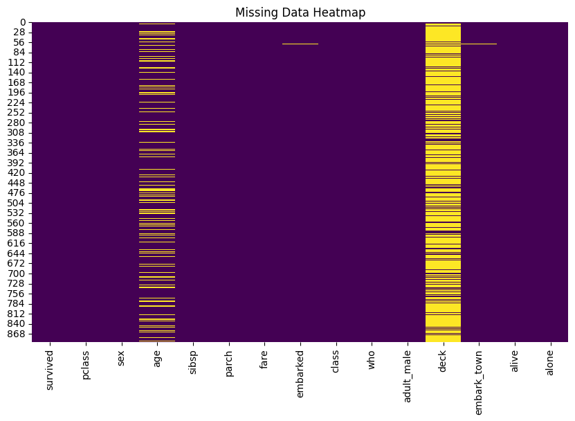
To handle missing data, we can:
- Impute missing values for
ageusing the median since it is a continuous variable. - Fill missing values in
embark_townwith the most frequent value (mode). - Drop the
deckcolumn due to the high percentage of missing values.
# Impute missing age with median
df['age'].fillna(df['age'].median(), inplace=True)

# Fill missing embark_town with mode
df['embark_town'].fillna(df['embark_town'].mode()[0], inplace=True)

# Drop the deck column due to excessive missing values
df.drop('deck', axis=1, inplace=True)

# Confirm no more missing data
print(df.isnull().sum())
Output:
survived      0
pclass        0
sex           0
age           0
sibsp         0
parch         0
fare          0
embarked      0
class         0
who           0
adult_male    0
embark_town   0
alive         0
alone         0
dtype: int64
After imputation and cleaning, we have no missing values in our dataset.
Step 3: Univariate Analysis
Univariate analysis involves analyzing each variable individually. This helps us understand the distribution and nature of individual features, whether they are numerical or categorical.
Numerical Features: Distribution and Box Plots
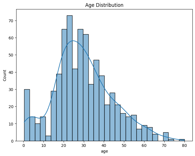
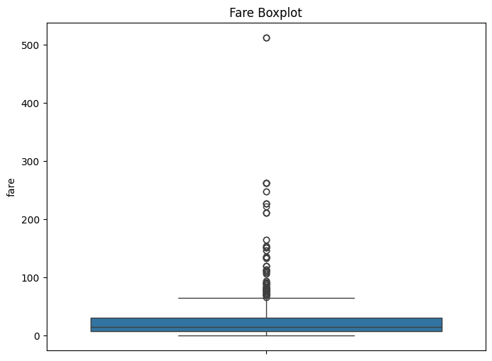
For numerical features like age and fare, we visualize their distribution using histograms and look for outliers using box plots.
# Distribution of age
plt.figure(figsize=(8,6))
sns.histplot(df['age'], bins=30, kde=True)
plt.title('Age Distribution')
plt.show()

# Boxplot for Fare to check for outliers
plt.figure(figsize=(8,6))
sns.boxplot(df['fare'])
plt.title('Fare Boxplot')
plt.show()
Output:
Fare Boxplot
Age Distribution
In the Fare Boxplot, we can see outliers, which are expected in datasets involving ticket prices.
Categorical Features: Count Plots
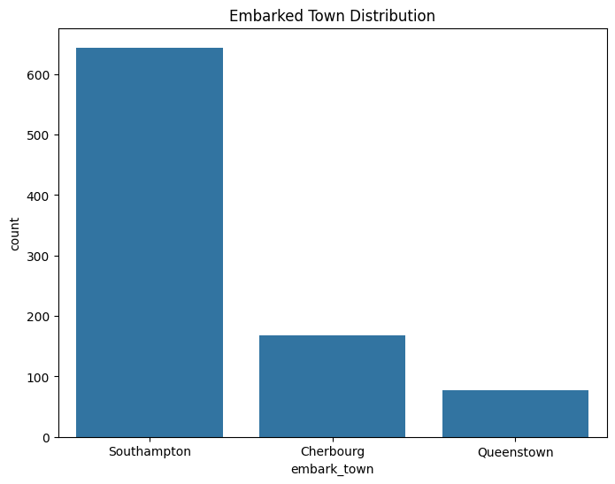
For categorical variables like sex and embarked, we visualize their distribution using bar plots to see the frequency of different categories.
# Bar plot for sex distribution
plt.figure(figsize=(8,6))
sns.countplot(x='sex', data=df)
plt.title('Gender Distribution')
plt.show()

# Bar plot for embarked town
plt.figure(figsize=(8,6))
sns.countplot(x='embark_town', data=df)
plt.title('Embarked Town Distribution')
plt.show()
Output:
Embarked Town Distribution
Gender Distribution

Step 4: Bivariate Analysis
In this step, we examine the relationship between two variables, usually one independent variable and the dependent variable (like survived). This helps us understand how different features influence the target variable.
Relationship Between Age and Survival
# Violin plot to show the relationship between age and survival
plt.figure(figsize=(8,6))
sns.violinplot(x='survived', y='age', data=df)
plt.title('Survival Distribution by Age')
plt.show()
Output:
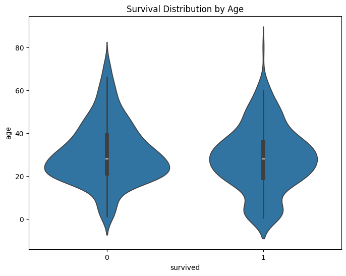
From this violin plot, we can see that younger passengers had a higher survival rate.
Relationship Between Passenger Class and Survival
# Bar plot to show the survival rate by passenger class
plt.figure(figsize=(8,6))
sns.barplot(x='pclass', y='survived', data=df)
plt.title('Survival Rate by Passenger Class')
plt.show()
Output:
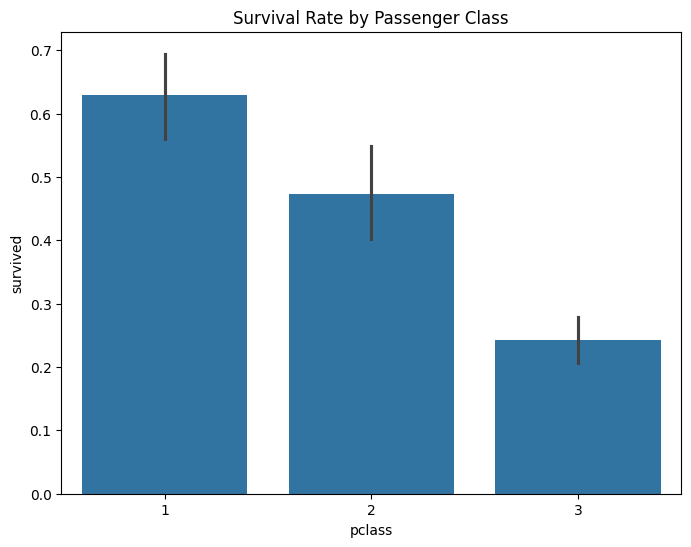
First-class passengers had the highest survival rate, while third-class passengers had the lowest.
Step 5: Multivariate Analysis
Multivariate analysis explores relationships between multiple variables at once. Pair plots, correlation heatmaps, and factor plots are commonly used for this.
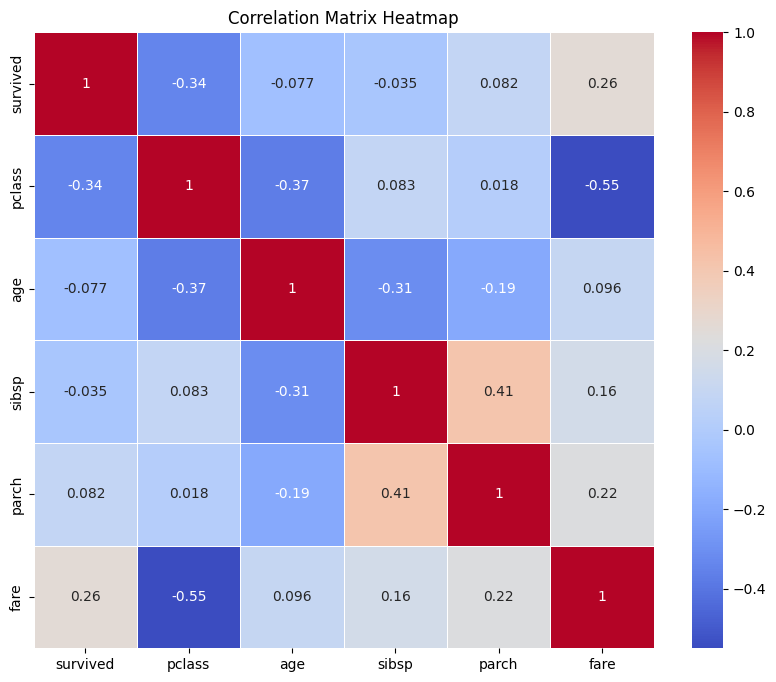
Correlation Matrix
A correlation matrix shows the correlation coefficients between numerical variables, revealing relationships between features.
# Filter only numeric columns
import numpy as np
numeric_df = df.select_dtypes(include=[np.number])

# Calculate correlation matrix
corr_matrix = numeric_df.corr()

# Plotting the heatmap
plt.figure(figsize=(10,8))
sns.heatmap(corr_matrix, annot=True, cmap='coolwarm', linewidths=0.5)
plt.title('Correlation Matrix Heatmap')
plt.show()
Output:
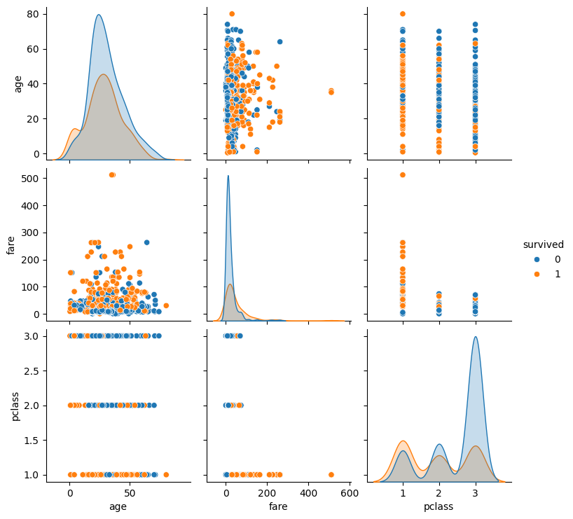
Pair Plot
A pair plot visualizes pairwise relationships between multiple variables, helping us see how features are distributed in relation to each other.
# Pair plot of selected features
sns.pairplot(df[['age', 'fare', 'pclass', 'survived']], hue='survived')
plt.show()
Output:
Step 6: Outlier Detection and Handling
Outliers can distort statistical models and analyses, especially in regression models. We detect outliers using the Interquartile Range (IQR) method and decide whether to remove them.
# Detecting outliers in 'fare' using IQR method
Q1 = df['fare'].quantile(0.25)
Q3 = df['fare'].quantile(0.75)
IQR = Q3 - Q1
outliers = df[(df['fare'] < (Q1 - 1.5 * IQR)) | (df['fare'] > (Q3 + 1.5 * IQR))]

# Removing outliers
df_cleaned = df[~df.index.isin(outliers.index)]
print(f"Shape of dataset after outlier removal: {df_cleaned.shape}")
Output:
Shape of dataset after outlier removal: (775, 15)
By removing outliers, we ensure that the dataset is cleaner and more representative of typical passenger behavior.
Conclusion
This guide provided a comprehensive exploration of Exploratory Data Analysis (EDA), covering univariate, bivariate, and multivariate analysis, as well as outlier detection and handling missing data. The steps demonstrated here are essential in understanding the structure of the data, identifying patterns, and ensuring that the dataset is ready for model training. EDA lays the foundation for the data science workflow, guiding feature selection, engineering, and model building.
Through a combination of Python code and visualizations, we uncovered insights from the Titanic dataset, explored relationships between variables, and ensured data quality. This step is crucial for making informed decisions throughout the data science process, ensuring better model performance and more accurate predictions.